
AI can produce credible-looking websites rapidly and for prototyping or a quick proof of concept that speed is game changing.
Website that need to support key business operations though need a point of differentiation and uniqueness and boiler plate AI design’s definitely do not do that.
Website’s need to be designed and built around their bespoke requirements, mapped to the needs of each audience and with user journeys that have been properly thought through.
Where AI design fits
AI is very good at getting something live quickly.
Testing a proposition or putting an early concept in front of stakeholders are sensible uses, and within our own projects we use it to speed up prototyping, content drafting and parts of the development.
AI output is assembled from the most common patterns on the web which is why most AI websites have very similar patterns in design.
Why AI-built sites look alike
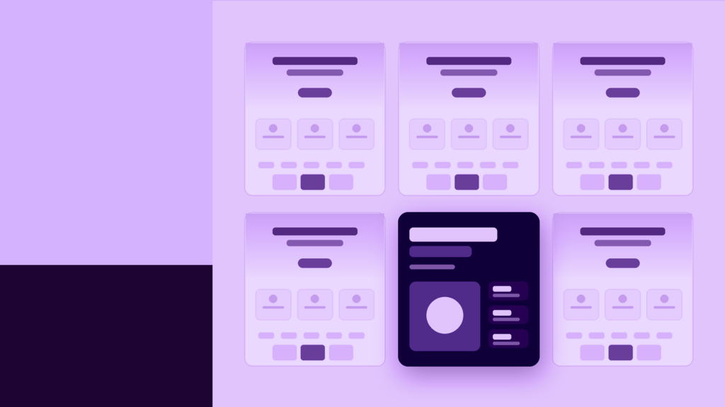
Most AI-built landing sites typically have a soft gradient behind a large headline, a row of feature cards with icons, then a logo strip, testimonials and a pricing table with the middle option highlighted.
The typeface is nearly always a clean sans serif, and the palette usually sits somewhere between purple and blue. They follow a similar design to that of pitch decks and reporting dashboards that have been built out using Claude.
One small audit shared recently looked at 100 AI-built sites and found 85 used the exact same layout.
Sameness on the web isn’t new. Theme marketplaces, easy-to-build layouts and clients asking for whatever was popular pushed sites towards the same formula long before AI, and we’ve built our share of them. AI follows the same instinct to copy what seems to work, only faster and at far greater volume, because it learns from what already exists.
It would be remis not to point out that at the speed AI is moving, things will change and progress in time, but as it stands, the sameness of website design could lead to damaging your brand.
Standing out in a crowded market
Most of the sectors we work in, such as private equity, financial services and professional services, are crowded and the website is one of the first places they compare them.
If your site shares a near on identical layout, imagery and tone with your competitors, you’re giving that buyer very little to separate you on. The more distinctive your website is, the better your chance of being remembered.
Similarly, producing marketing content has never been easier, so differentiation has become considerably more valuable. Being distinctive in this sense means the site is visibly yours, built from your positioning, your people and the results you can evidence.
Bespoke design starts with your audiences
B2B websites rarely serves one audience and a design needs to map against each one’s requirements first: what they need to find, what would reassure them, and what you want them to do next. The structure, content and design follow from that.
A private equity firm might need to speak to institutional investors, management teams of potential portfolio companies, intermediaries and future hires, each arriving with different questions and a different level of knowledge.
User journeys are where this pays off and a considered journey taking an investor from the homepage to the track record and team they care about, or takes a prospective client from a service page to a relevant case study and a clear next step, without either of them having to work it out for themselves.
Those journeys are rarely there in an AI-generated layout, because they depend on knowledge of your business the tool doesn’t have.
The firms investing are seeing the results
Our clients who’ve invested in bespoke websites are seeing it pay off in their numbers.
After moving to a new, more dynamic website, Coller Capital saw a 52% year-on-year increase in total users.
Through a dedicated website management retainer, Forvis Mazars has seen a 107% year-on-year increase in sessions across its careers sites.
AAR Group’s new site, built to serve two distinct audiences, delivered a 90% increase in average session duration.
The redesign for Mayfair Equity Partners brought 60% faster load times on desktop.
Each of those projects started with a deep research into who the site needed to serve, and several have continued with ongoing management and optimisation after launch.
AI can help with research but it rarely is able to know the full picture and be able to map things out incorporating all the needs of the different potential users.
Fewer clicks make every visit count
AI Overviews and answer engines are resolving more questions before anyone reaches your website.
Research from Pew found that Google users clicked a traditional search result on 8% of visits where an AI summary appeared, compared with 15% where one didn’t.
Datos’ State of Search report for Q1 2026 showed zero-click searches easing slightly on desktop across the US, EU and UK. Over the last few years, though, organic visits have been under steady pressure for many B2B businesses, which makes the quality of each visit far more important.
When fewer people arrive, each one needs to find what they came for quickly and leave confident enough to get in touch.
That comes down to trust: real photography of your team, your senior people explaining things in their own words, case studies with named clients and results, and journeys that lead somewhere useful. A template can’t produce any of that for you, and buyers are getting better at spotting when a site has been generated.
Search engines appear to be heading the same way. Google’s documentation now puts more emphasis on human effort, originality and skill when it assesses content quality, and we’d expect search engines and LLMs to keep rewarding the signals their users value.
What we’d recommend
A useful first check is to put your homepage next to a few competitors’ homepages and cover up the logos. If it’s hard to tell them apart, your buyers are probably having the same problem.
If you want a benchmark for what a memorable experience looks like at this level, it’s worth checking out the Freshfields and Sequoia Capital websites Both are good examples of firms whose websites feel distinctly their own and stand out amongst their competitors.
From there, review your highest-value journeys, for example an investor looking for track record or a prospect comparing your services, and test how easily someone can complete them.
Bringing in photography of your actual team and rewriting key pages in the words of your senior people are usually the quickest ways to build trust.
Where a partner adds value
We work with more than 100 B2B organisations, including Transport for London, Forvis Mazars, Coller Capital and Mayfair Equity Partners.
All our work is completed in-house, so the audience research, journey mapping, build and ongoing optimisation all sit with one team that knows your business.
We’re Cyber Essentials certified and ISO 9001 accredited, and our hosting infrastructure is ISO 27001 accredited.
AI is part of how we work and it speeds up a lot of the build. For particular projects and clients where speed to market is the priority, we rely on it much more heavily, and that’s the thinking behind our AI-powered product development work.
Unique human expression is going to become more and more prevalent and something buyers seek out and are prepared to pay more for.
If you’re planning a new website or want to understand how your current one compares with your competitors, give us a shout and we’d be happy to talk it through.