A consistent, well-crafted interface reinforces your brand values, establishes credibility, and builds user trust from the very first interaction.
When design aligns with purpose, users feel more confident engaging with your product.
We start by researching your brand and understanding how we are going to apply it digitally.
This involves us creating moodboards which represent a visual compilation of uses of colour, typography, structure, images and other visual components. These moodboards are the basis for a full UI design.
Solving common UI challenges for a consistent, responsive experience
From visual inconsistencies and clunky interactions, to poor mobile responsiveness, we design interfaces that are polished, intuitive, and seamless across every device.
Get in touch with Will to see how SoBold can help.

Founder

Accessibility & compliance
We run a series of accessibility tests to ensure compliance with the Web Content Accessibility Guidelines (WCAG).

A seamless experience on mobile, tablet & desktop
We focus on crafting a cohesive and engaging user journey that fluidly adapts to every device, screen size and breakpoint.

Animation & interaction
Every micro-animation is integrated from the start to enhance user experience and guide interactions intuitively.

Visual inconsistency
We adhere to a comprehensive suite of industry-approved QA processes to test designs.
User Experience design
UX design makes your website easy to use - encouraging repeat engagement, building loyalty and, ultimately, driving revenue. Get a competitive edge and ensure you never lose potential customers to competitors.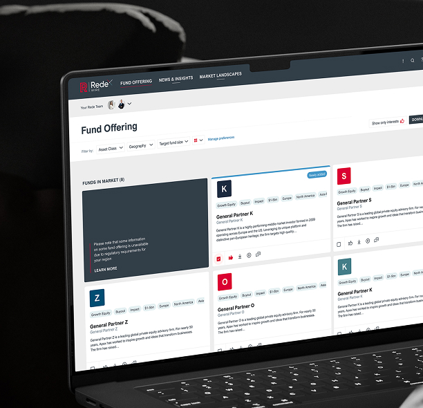
Usability testing
It’s crucial to ensure a website is performing as expected, and this is where SoBold's usability testing comes in. We evaluate a website’s design and functionality by observing real users as they interact with the site.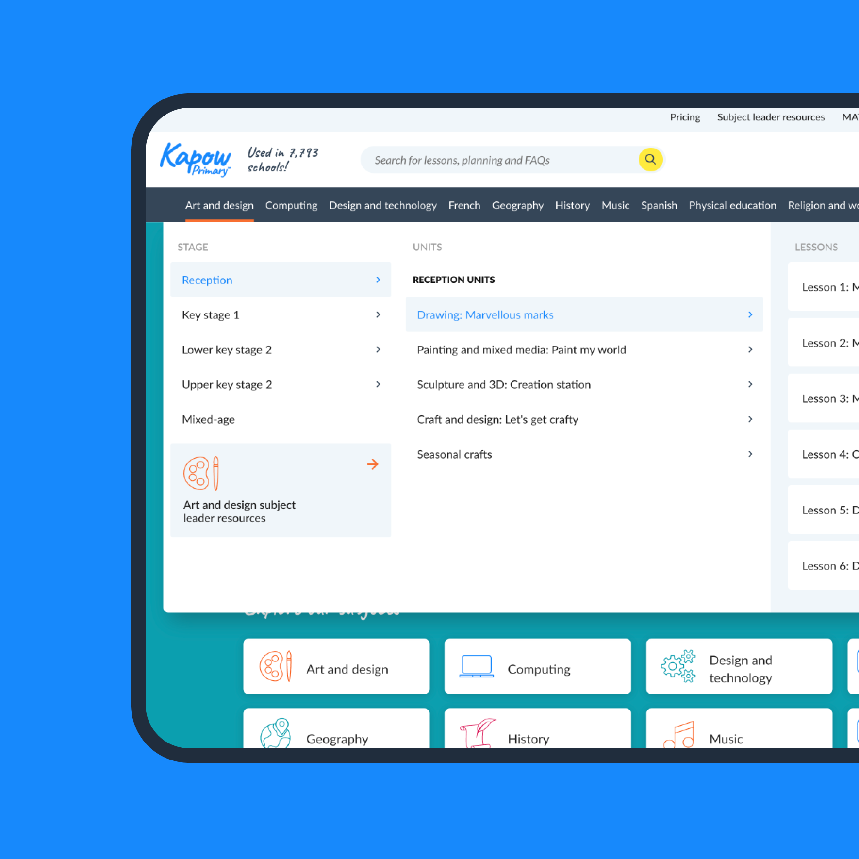
UX audit
Ensure your website aligns with user needs and business goals, uncover usability issues, and find opportunities to improve your website performance.What our clients say
 Mark Christie
Chief Information Officer
Mark Christie
Chief Information Officer
 Lucienne Hill Smith
Senior Analyst
Lucienne Hill Smith
Senior Analyst
 Charlotte Florence
Group Commercial Director
Charlotte Florence
Group Commercial Director
 George Hosegood
Founder
George Hosegood
Founder
Some of our website design projects
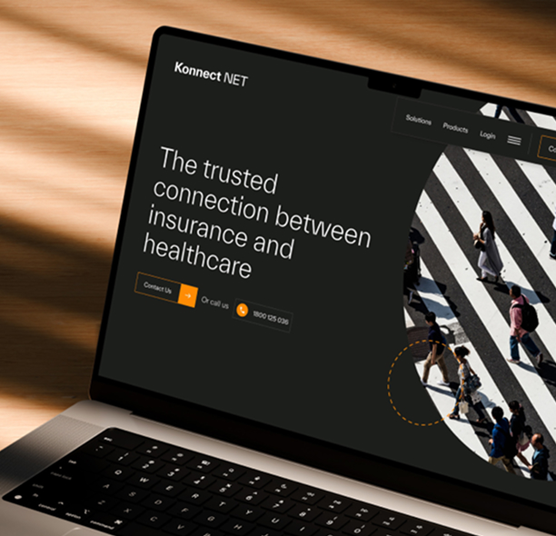
A new look and feel for leading Healthcare Insurance provider, Konnect Net, as they launch in Australia.
A fresh brand, and website for Australasia’s largest health IT network, Healthlink
Related news


Common questions about UI design
What is UI design and how does it differ from UX?
UI (User Interface) design is the visual layer: colours, typography, spacing, imagery, and interactive elements. UX defines the structure and flow; UI brings it to life visually. Both work together to create a cohesive experience.
How do you ensure brand consistency across the interface?
We start with a brand research phase and create a moodboard that establishes colour, typography, structure, and imagery direction. This becomes the foundation for every UI element, ensuring consistency across all pages and screen sizes.
Do you design for mobile, tablet, and desktop?
Yes. Every UI design is responsive across five breakpoints: 1920px (external monitors), 1366px (laptops), 992px (notebooks and iPads), 768px (tablets), and 375px (mobile).
How do you approach micro-animations and interactions?
We integrate animation and interaction design from the start of the UI process, considering how elements respond to user actions. Micro-animations are used purposefully to guide attention, provide feedback, and enhance the overall feel of the interface.
What does the UI design process look like?
We begin with brand research, then develop a moodboard for approval. From there, we design full-page UIs across all breakpoints, refining through client feedback rounds before preparing final assets for the development team.