All our website design projects are underpinned with planning to ensure the UX and UI work together for maximum results.
A comprehensive analysis allows us to define the website’s full scope and architecture, creating a content framework for our clients to work with.
Using the sitemap and content block mapping as a foundation, we create high-fidelity wireframes which serve as a blueprint for the website, showcasing the structure, layout, and user flows.
A well-defined process
We embrace a structured and sequential waterfall process, ensuring each phase is thoroughly planned, executed, and reviewed before moving to the next.
Research & planning
Research & planning
Visual exploration
Visual exploration
User Experience (UX) design
User Experience (UX) design
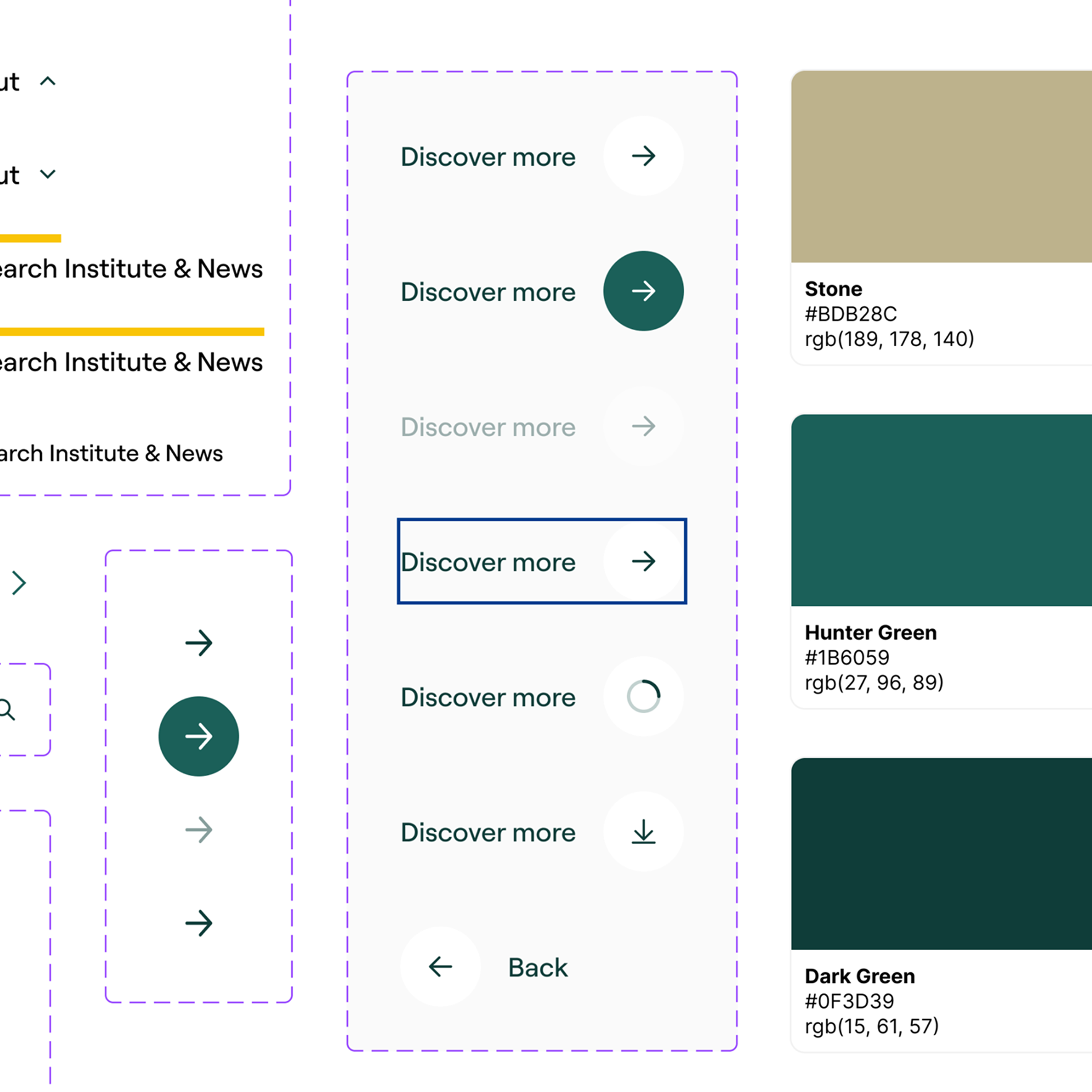
User Interface (UI) design
User Interface (UI) design
Preparation for development
Preparation for development
Build
Build/Development Phase
Testing
Testing
Launch
Go live
Platform design
Our design process is flexible, with our knowledge and experience allowing us to deliver enterprise platforms that scale.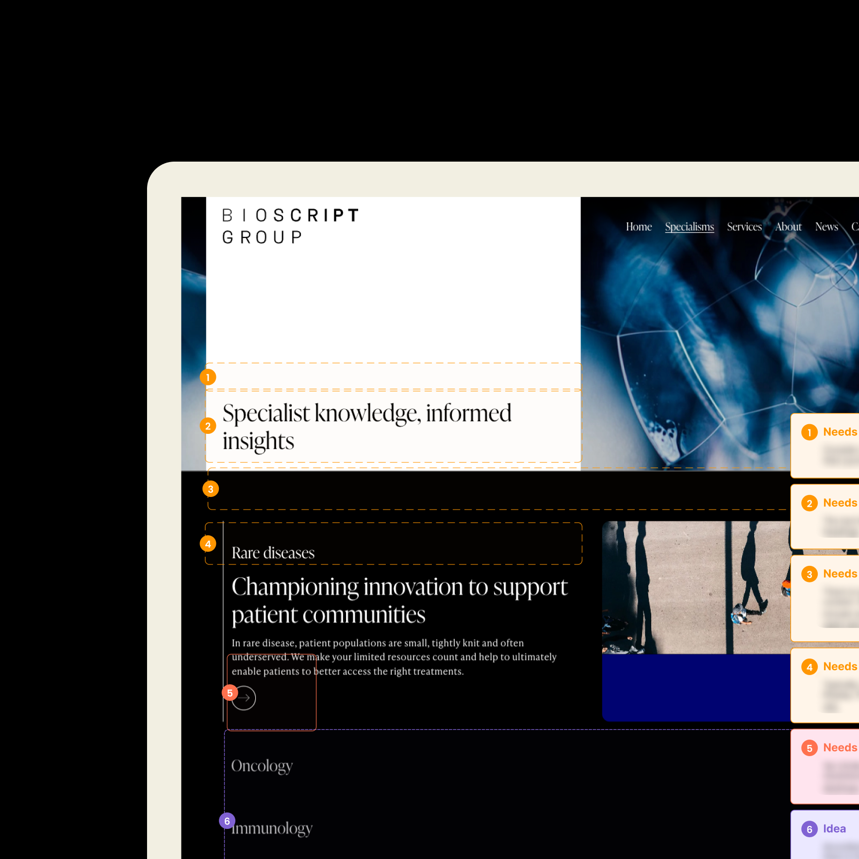
User Experience design
UX design makes your website easy to use - encouraging repeat engagement, building loyalty and, ultimately, driving revenue. Get a competitive edge and ensure you never lose potential customers to competitors.What our clients say
 Anish Patel
Director of Practice
Anish Patel
Director of Practice
 Toby Hannington
Co-Founder
Toby Hannington
Co-Founder
 Lauren Turner
Director of Marketing
Lauren Turner
Director of Marketing
 Donal O'Nuallain
Marketing Manager
Donal O'Nuallain
Marketing Manager
Some of the websites we've designed
View all workTransforming Coller Capital's Customer Experience by Migrating to a New, More Dynamic Website
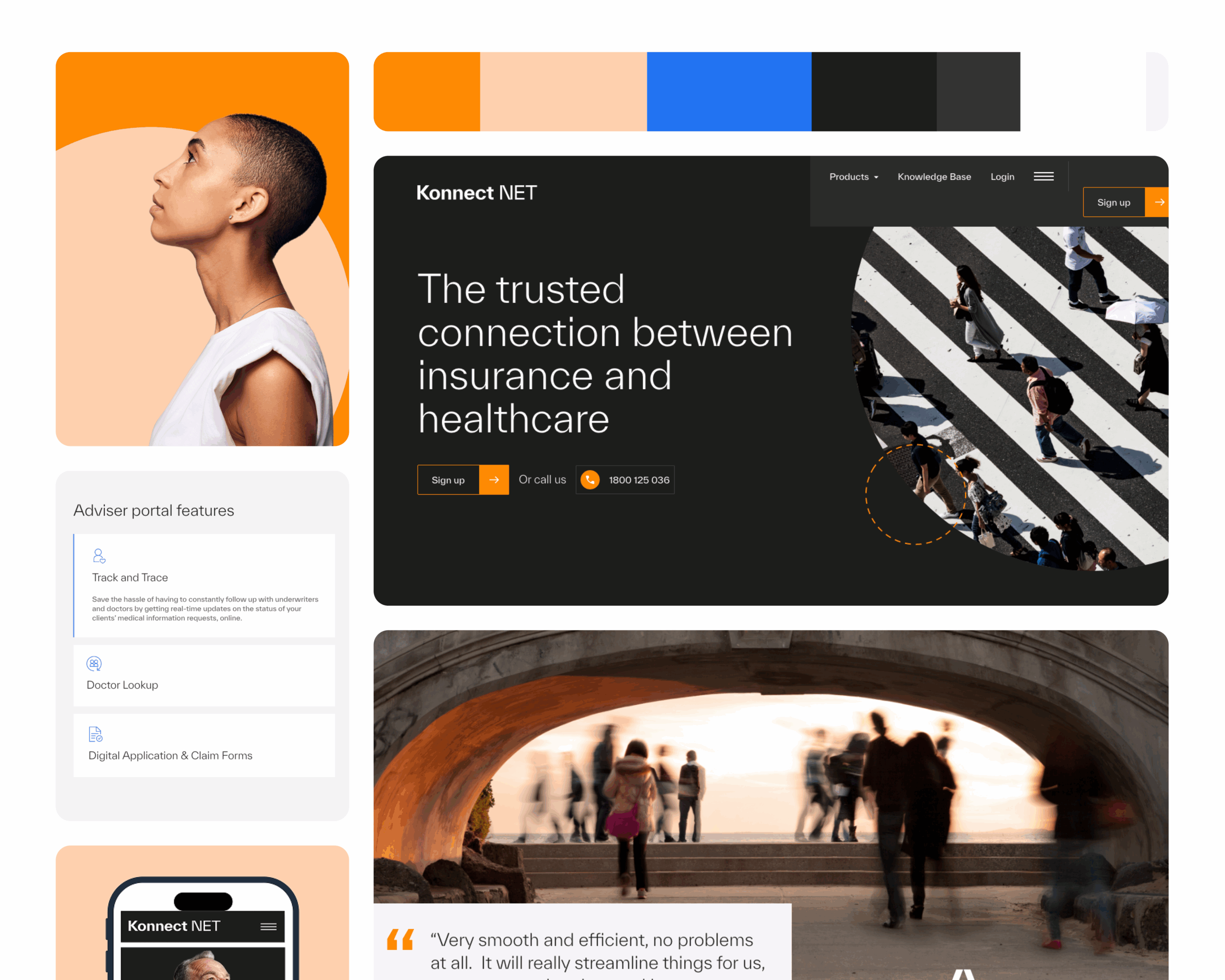
A new look and feel for leading Healthcare Insurance provider, Konnect Net, as they launch in Australia.
Related news


FAQs about our website design work
What is the research and discovery phase in website design?
We underpin all our design projects with thorough research to help us understand and define the full scope of the website and architect the website information.
We will analyse your primary and secondary audiences. This will enable us to be clear on the design routes they will need to get the information they are after.
By addressing key questions early, we ensure that the website’s architecture and design are scalable.
How does your UX phase ensure your designs will have good usability?
We take a user-first approach, keeping designs simple, intuitive, and accessible. Usability audits, user testing, and mobile-first design help ensure a smooth experience for all users.
How do you ensure the UI is accessible for all users?
SoBold follows WCAG (Web Content Accessibility Guidelines) to ensure that all our website designs are accessible. This includes high-contrast colours, ensuring images have alt text, keyboard and screen-reader friendly interactive elements, and clear labelling—ensuring usability for all and compliance with accessibility standards.
What breakpoints will you design in?
We design all our designs for mobile, tablet and desktop. The breakpoints we design to are:
- 1920px – Most external monitors
- 1366px – Most laptop screensizes
- 992px – Most notebook / iPads devices
- 768px – Most other tablet devices
- 375px – Most mobile devices
How do you ensure website scalability for growing enterprises?
SoBold approach design using design systems that can easily be upgraded and extended without disrupting existing operations.