When a visitor lands on your website, the visual design is likely to be the first thing they’ll notice. It’s also usually the thing they’ll remember most.
75% of consumers reportedly judge a business’s credibility based on its website design. This first impression can make or break a prospective client’s interest in working with you.
The ultimate goal of your website is to attract and retain as many prospects as possible, and then convert them into clients. But most websites are designed in a way that leaves those goals unfulfilled, failing to reach their full potential.
With that in mind, your visual identity should be treated as a top priority within the overall design of your website. Believe it or not, this can have a significant influence on the growth and success of your business.
When working on a web design project, you should always go through a careful visual exploration phase to find the right visual identity for your website.
Whether you’re going through a full company rebrand or just refreshing the style of your website, it’s important to ensure your design is tailored to your specific target audience. This is how you begin to drive business growth through your website.
Without a visual exploration process, your website may not convey your company’s brand identity and values as clearly as you’d like it to.
In this article, we’ll outline the steps taken so you’ll know what to expect when working on a website design project.
What Does the Process Involve?
The purpose of this process is to define the best visual direction to take with your site.
This is a crucial aspect of your overall design, with aesthetic elements being brought together to create a look and feel that engages your site’s visitors and retains their attention. To achieve that, your visual design needs to establish a connection between your audience and your brand immediately. It should also demonstrate why your visitors should work with you.
Exploring your visual identity will cover a wide range of elements, including:
- Your brand
- Your company values
- Your colour scheme
- Your typography
- Imagery and other visual content
- Structuring of pages
- And other visual components that are used to tell your brand’s story across your website’s design.
What are Mood Boards and How Can You Use them?
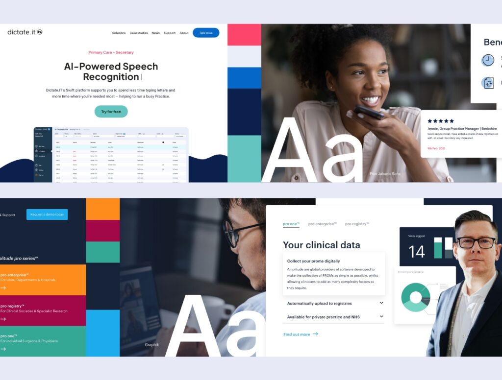
The main tool used to help determine the right visual identity is a set of mood boards.
These are a visual compilation of all the various elements that make up your website’s visual design. Each mood board is essentially just a single-page collage of design styles based on previous discussions and the findings from the research and planning phase of the process.
The aim of these is to capture your brand’s visual style and tone. This will give the stakeholders, and your designers, a shared understanding of the design you’re working towards.
Mood-boarding helps you visualise the work on your website’s design before it begins and agree on a design aesthetic that accurately reflects your brand identity and values.
Think of this like a problem-solving exercise. Your design agency will take a research and data-driven approach to conveying your brand identity, while also catering to your target audience and accommodating the latest industry trends.
Collaboration and Iteration
Like most processes within web design and development, this visual exploration process should be collaborative and iterative.
You’ll typically be presented with a mood board and a set of ideas by your agency partner, then given the chance to provide feedback across several rounds of revisions.
Rounds and revisions are always important in any creative process. It’s usually necessary for your agency to develop and present a minimum of three mood boards before the optimum aesthetic is agreed upon. This is a crucial step towards the ultimate goal of creating a new website that accurately reflects your brand and has a positive impact on your target audience.
Connecting with Your Clients Through Design
Your website’s visual identity is what makes your brand resonate with your target audience. Your design needs to clearly convey the values of your business, the quality of your products and services, and the reason why your visitors would benefit from working with you.
Working through this visual exploration phase is an important step towards designing a website that will attract more visitors and increase your conversions.
Once this visual exploration is complete, the next phase of your web design process will be to craft your website’s user experience (UX).
Would you like these insights straight to your mailbox?
Latest from agency
8 December, 2022
Sam Phillips and Will Newland interviewed by Cloudways
Technical Director, Sam Phillips and Managing Director, Will Newland were interviewed by Brent Weaver at Cloudways.
SoBold has been working with Cloudways since 2019 to help host development environments for all of their clients.
You can learn more about Cloudways, Managed Cloud Hosting services by visiting their website here.
See what they had to say in the video below.
Would you like these insights straight to your mailbox?
UX Design
11 July, 2022
Speak our language: UX/UI Glossary
For designers, it’s almost an impossible task to effectively deliver a project without understanding the joint language of design. This terminology and jargon can often get thrown around in meetings, although it’s good practice to read the room and speak a mutual language it’s good to get a little insight. Below is a glossary of essential UX/UI terms grouped into topics.
General terms
Accessibility
A measure of a web pages usability for a range of people, including people with disabilities.
Design system
A document that houses design components and styles to use across a website or product, ensuring consistency.
Design thinking
The process of creating and executing strategic ideas that solve problems.
Flat design
A form of design that focuses on minimalism using 2D elements and strong colours.
Human-centred design
An approach that finds solutions with a human perspective in every step of the design process.
Information architecture
Or otherwise known as a sitemap, is the structural design of information.
Landing page
A stand-alone page that a person lands on after clicking from a digital location.
Onboarding
A flow that guides the user through a set of instructions such as choosing preferences, product usage and UI elements.
Responsive design
A design and usability process that adjusts content based on the device screen size.
UI Design
This determines how an interface will look and guide the user on how to interact with a product such a colour choices and layout.
Usability
The quality of the start-to-end user experience.
UX Design
The process of determining how a digital product should work based on relevant user research and best practices.
Acronyms
CTA (Call to action)
A graphical component that guides the user through the main flow and encourages them to take a specific action. Normally it will be the element that stands out most on a page.
CWV (core web vitals)
Are three metrics that score a user experience loading a page, those are: how quickly content loads, how quickly a browser loads the webpage and how unstable the content is as it loads.
GA (Google Analytics)
A web analytics service offered by Google that tracks and reports web traffic.
KPI (Key performance indicators)
A Performance measurement approach based on certain metrics over a certain time period.
MVP (minimum viable product)
A version of a product that is released with just enough features that deliver on the initial user needs to then improve and develop further.
PM (Project manager)
A person that leads a team in order to achieve all the project goals in a set of timelines.
SVG (Scalable Vector Graphic)
A two-dimensional vector-based graphical element that is scalable and widely supported across the web.
SWOT (strengths, weaknesses, opportunities and threats)
A marketing tool that identities assess your business and analyse your competitors.
Design Process
A/B testing
A UX method that involves showing two versions of a specific page or product to see which one works better.
Card sorting
A technique that can be used by both UX designers and users that help determine the information architecture of the product based on logical ordering.
Cluster mapping
In other words, an affinity diagram is for sorting UX user findings into organised sets to lay down the foundations for desirable features.
Competitor analysis
A research method that shows strategic insights into a competitor’s features, functions and even visual positioning.
Eyetracking
A study that allows researchers to evaluate the movements of a particular user when they are using a product.
Focus group
Typically a researcher will talk to a group of people to find out opinions and generate ideas on the product or service.
F shaped pattern
Is a layout designed to guide the user’s eye to specific information based on human behaviour.
Mockup
A visual representation of a product in an environment could be a concept or the finished product.
Moodboard/style scape
Is a collection of visual inspiration gathered from an initial concept to visually communicate an idea.
Prototype
Is an early version of a product that is simplified to test main user journeys and functionalities.
Sketch
There will always be a place for pen and paper. At this stage in the prototyping process, a researcher can quickly come up with design solutions and compare them to determine the best one.
Storyboard
A visual way of communicating the user journey.
Usability testing
An approach that is done typically throughout the whole design process, ensuring that the product has ease of use and matches the user’s requirements.
User flows
A flow that represents a users task from an entry point to a desirable end one.
User interview
A one-on-one chat that can gather information for a user persona and insight on their behavioural habits on a product and or service.
User journey
Like the user flow, a user journey is a route that maps out their journey from beginning to end, the difference is that a journey includes emotions and behavioural choices.
User Stories
A narrative-based resource that sums up the patterns of how they interact with the product, focusing on motivations and frustrations.
Wireframes
A low-fidelity design that focuses just on structure and layout without clouding the mind with visuals. Its purpose is to ensure the interaction between user and interface is solid.
Design elements
Breadcrumbs
A layered component that allows users to navigate through multi-level pages.
Contrast Colour
Ensuring there is enough visibility between two colours to the layer or text is legible and ideally meets WCAG standards.
Grid
Is a layout system with rows and columns, making it easier for designers and developers, also for making clean and symmetrical interfaces for users.
Layout
The order of certain content such as text and images are laid out on a page.
Navigation
An organised hierarchy of information allows the user to find the information they are looking for.
Typography
Typeface or Font. there is a difference. A Font is a weight or variation of a typeface and typography is the arrangement of those styles to ensure it’s legible and appealing.
White space
Or negative space is the strategic positioning of elements on a page so they have room to breathe and for people to absorb content.
Widget
A self-contained design component that has certain functionality.
Would you like these insights straight to your mailbox?
Company Milestone
3 December, 2018
SoBold selected to work with Transport for London
SoBold Limited (SoBold), a leading digital and web marketing consultancy, is delighted to announce that SoBold has been selected to work with Transport for London (TfL) to build, manage and support a bespoke Cookie Consent Management Tool for use across TfL’s portfolio of websites.
SoBold’s rapid growth over the previous 12 months has seen them become a leading player in the digital and web marketing space. SoBold’s core offerings are now used by over 200 customers worldwide and we anticipate this customer base to continue to grow considerably over the next 12 months and beyond.
SoBold has been an authorised Reseller of Cookiebot since the new General Data Protection Regulation (GDPR) came into place on 24 May 2018. Cookiebot’s tool consists of three main features: cookie consent, cookie monitoring and cookie control and SoBold work with their clients helping them manage, build and integrate these solutions onto their websites. SoBold now manage Cookie Consent Management for clients across numerous different industries.
Transport for London has completed a formal tendering process to procure a new Cookie Consent Management Tool for their tfl.gov.uk website domains. By procuring the tool, Transport for London is best able to align their approach to cookie management with the requirements of data protection legislation. SoBold will work with Transport for London, for a minimum of 12 months with the option of extending the contract for a further 24 months.
SoBold Founder and Managing Director Will Newland, commented:
“We are absolutely delighted to work with Transport for London. This gives SoBold the opportunity to work with a large, well known, corporation and we have no doubt we can play a big part in ensuring Transport for London’s customers can feel safe and confident when sharing information about themselves on the TfL website. This further strengthens SoBold’s position as a leading player in the Cookie Consent Management space.”
SoBold Lead Developer Sam Phillips, commented:
“This is a fantastic opportunity for SoBold to showcase our experience in the delivery of bespoke Cookie Consent Management solutions across a portfolio of websites with millions of visitors per month. The contract with TfL cements our position as a leading CookieBot reseller in the United Kingdom.”
Would you like these insights straight to your mailbox?
Company Milestone
10 June, 2021
Clutch recognizes SoBold as a top web developer in the UK
As a web developer team, our responsibility is in providing support to other companies. We make sure that websites look and work well for the businesses that need them. Our team serves as an expert extension of our clients so they can focus on their actual operations.
We take pride in our work and it looks like our efforts are paying off. We’re very happy to announce that we’ve been given an award. SoBold was named as a top UK web developer by Clutch for the year 2021.
Clutch is a ratings and reviews company that uses a unique verification process that ensures all of the content on their platform comes from legitimate sources. They then leverage this information to create ranked lists of the best performers in every industry around the world. The best of the best then get an award.
The best part of all this award is that it’s not decided by a panel of faceless judges. It’s based on the reactions of the people that worked directly with us. They’re the people in the best position to judge or critique our work. In fact, here’s what our Director had to say when we got the news.
“We are absolutely delighted to be chosen as one of the leading WordPress Development agencies in the UK by Clutch and look forward to continued growth and development to fulfil our potential.” Will Newland, Managing Director, SoBold.
If you want to partner with a team that will provide expert support and service to ensure your website is the best it can be, give us a call. Fill out our contact form and we’ll set up an appointment as soon as possible.
Would you like these insights straight to your mailbox?
Industry News
21 June, 2022
Pixel Pioneers Bristol 2022
If you’ve never been to a conference of any type before, you possibly think you already know the important areas of your profession and can find out any developments from your colleagues or the internet. At least that’s what I thought prior to attending Pixel Pioneers 2022.
Which option sounds more appealing to you? Pick up extra skills on occasion, or go to a conference and absorb a mega-dose of industry knowledge, make connections and enjoy exploring fresh surroundings? Luckily at SoBold we have the opportunity to do both.

The conference covered both ends of the telescope – from broad topics such as energy consumption, to a fifty minute talk about the brief three milliseconds your screen goes blank in between webpage loads. How the visually impaired experience the internet, to technical developments in styling / fonts.
My personal hero was Chris How – his mantra of valuing your customer’s time and giving them small moments of delight strongly resonated with me. In accordance, I want to guide you through the content of the conference, with links to the core material that will best replicate what the SoBold team saw, whilst valuing your precious time.
GAVIN STRANGE : Less Thinkering, More Tinkering
A must watch to boost your levels of creativity. Gavin shares his personal and professional projects with Aardman Studios. Lots of useful insights into reaching the pinnacle of creativity. Highly engaging delivery, visuals and plenty of ‘further reading’ material. Definitely worth watching in entirety. Gavin Strange website – will give you a sense of his creative flair and influences. https://www.jam-factory.com/
“It’s better to beg for forgiveness, than ask for permission.”
Gavin Strange

BIANCA BERNING : Variable Fonts – WTF?
From a technical and design standpoint, learning about variable fonts is incredibly useful. Towards the end Bianca veers into the potential application of variable fonts – imagine a world where your computer mutates its content to fit the viewer’s specific needs. If you’re looking for new avenues for unique artistic features for your website – this talk is for you. Everyone should have a play with variable fonts – try it here https://v-fonts.com/

CHRIS HOW : You Got to Fight for the Right to Delight
Chris’s choice of examples and commentary is intentionally entertaining and eclectic. His approach to design changes your criteria for success and also would decisively influence your next project. Essential viewing. Whether you’re a seasoned designer or developer short of a design, this talk will give you a guiding direction. Information on the Kano product roadmap here. https://www.productplan.com/glossary/kano-model/

LÉONIE WATSON : Accessibility: The Land That Time to Interactive Forgot
Visually impaired people experience the internet through screen readers – the internet described in words. Léonie’s valuable insight will definitely re-balance your priorities and appreciation for how websites should function. Some of the technical history she overviews was a bit lost on the audience but the switch in mindset is valuable. Important to dip into, especially for gleaming a deeper understanding of how a web document is compiled and loaded. It might sound ‘techy’ but it’s like understanding how our lungs work – illuminating. If you haven’t viewed any of your own websites using a screen reader – you definitely should. For a great sense of how the net is best experienced for visually impaired users – just check out her website – tink.uk
LUKE MURPHY : Lightning Talk: Design Tokens – Searching for a Source of Truth
Design Tokens act as a very useful tool for blending the boundaries of where design and development meet, in fact, they act as a technical element that affect design and development in equal measures. If you have no idea what a design token is – this talk could unlock a tonne of structure for your product. Here’s an overview article on design tokens

HANNAH SMITH : How to Make Digital Services More Sustainable
Hannah Smith’s talk invited us to critique our energy consumption and make changes to our habits as both consumers and producers of digital content. She makes the case that space travel is a waste of resources, and that using less lays the path to fulfilment. See if her arguments resonate with you. Hannah’s book recommendation – Doughnut Economics by Kate Raworth
JHEY TOMPKINS : Supercharge Your Skills with Creative Coding
A mad professor of CSS and JavaScript – Jhey has a mixture of technical tricks and interesting libraries for speech recognition. Deadpan yet full of colourful examples, Jhey clumsily demonstrates his collection of magical creations and challenges you, the developer, to break out of your ‘siloed’ mentality for visual presentation. Check out his catalogue of wondrous CSS/JS creations here

STUART LANGRIDGE : You Really Don’t Need All That JavaScript, I Promise
Painting with the broad brushes down to the nat-hair infinitesimally small details, Stuart reminds us of the importance of returning to the basics in order to best utilise the web. Unfortunately some of the libraries he suggests do not have extensive compatibility and thus aren’t for mainstream production… yet. His insight does provide a deeper understanding of the mechanics of the tools we use, although the message is quite drawn out. Example of the shared transitions js library https://codepen.io/drenther/pen/NjzeOO
RACHEL ANDREW : What’s New in CSS?
Rachel Andrew – new css features either in or emerging from or newly arrived from CSS-land. Truly at the coalface of emerging CSS features. For a frontend developer it was akin to being shown new letters in the alphabet that were being proposed. A summary of similar information can be found here – https://www.smashingmagazine.com/2022/03/new-css-features-2022/

Bristol itself is well worth a visit – a centre for nightlife, hedonism and youthful idealism. Simply walking around the harbour area in the daytime will refresh your appreciation for one-of-a-kind shops and overflowing street art. Make sure you have plenty of free space in your phone for all the photos. The SoBold team had a very enriching experience and bonded even tighter as a team. I hope to see you at the next one!
Links to the conference videos will be available via the Pixel Pioneers website.