Sector: Healthcare
SoBold had been working with Healthlink for the previous two iterations of their website. The brand has grown considerably with them becoming Australasia’s largest health IT network. This industry-leading positioning needed to be portrayed through their new brand and website.
Launch websiteThe challenge
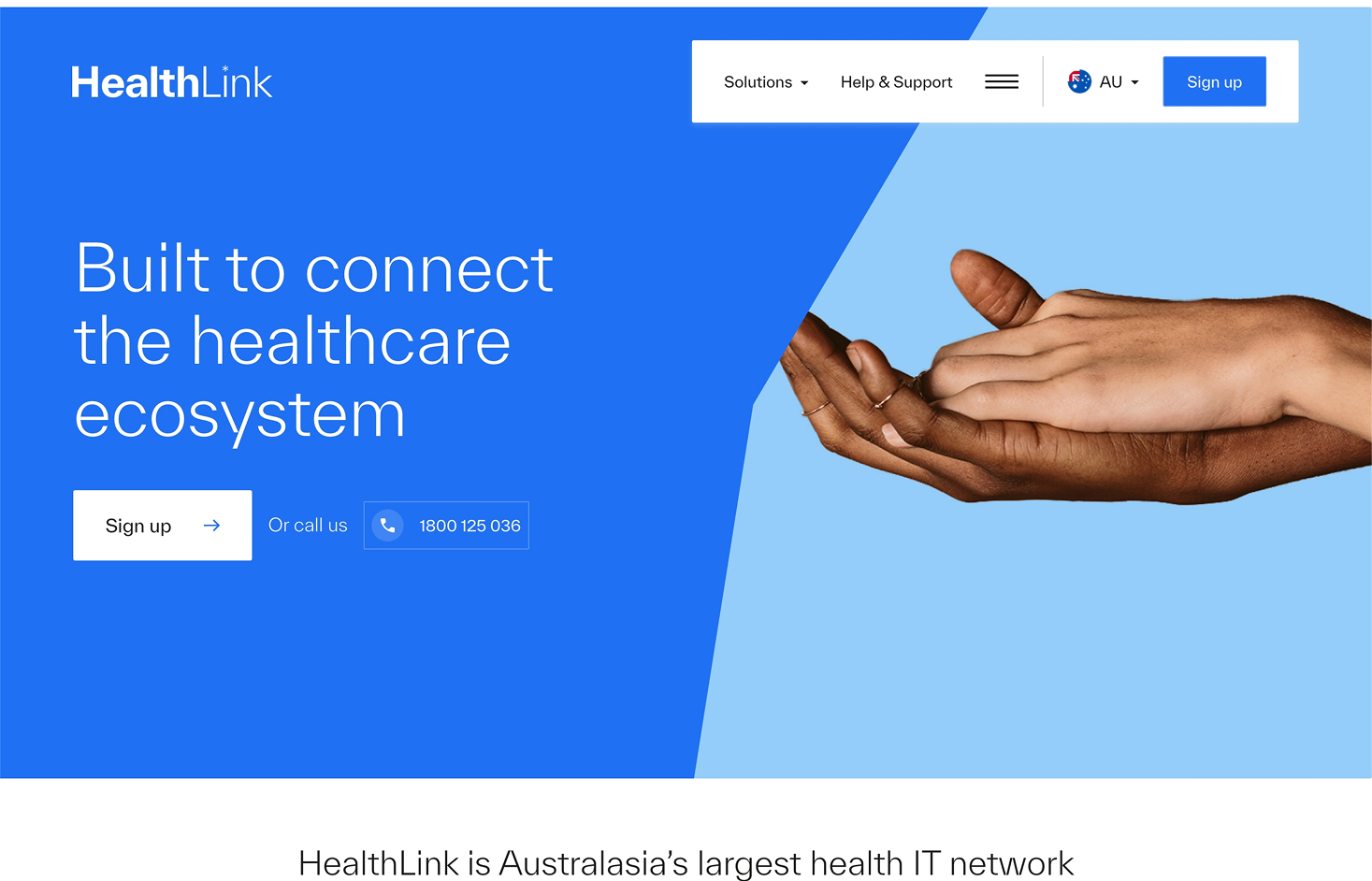
Healthlink went through a major brand refresh, with a goal to reintroduce itself to the market as a forward-thinking, industry-leading healthcare brand across Australia and New Zealand.
Healthlink’s goals for the project were focused on generating more leads, increasing brand awareness, driving more engagement, and, most importantly, presenting themselves as a leader in Australasian Healthcare tech.
The results
Core Web Vitals passed on mobile and desktop
Mobile LCP: 1.8 seconds
Mobile INP: 102 ms
Mobile CLS: 0
Working with SoBold since: 2022
What we did
We collaborated with the Healthlink brand team to bring their vision to life online, focusing on modern UI, enhanced functionality, and an elevated user experience.
New website data metrics
Success snapshot
Brand application
Healthlink’s brand identity, built upon two shades of blue, an orange, and two greys, emphasised the primary blue for visual brand equity.
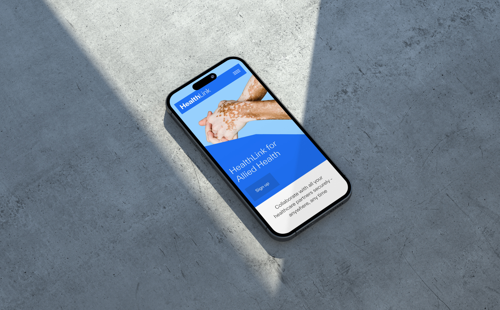
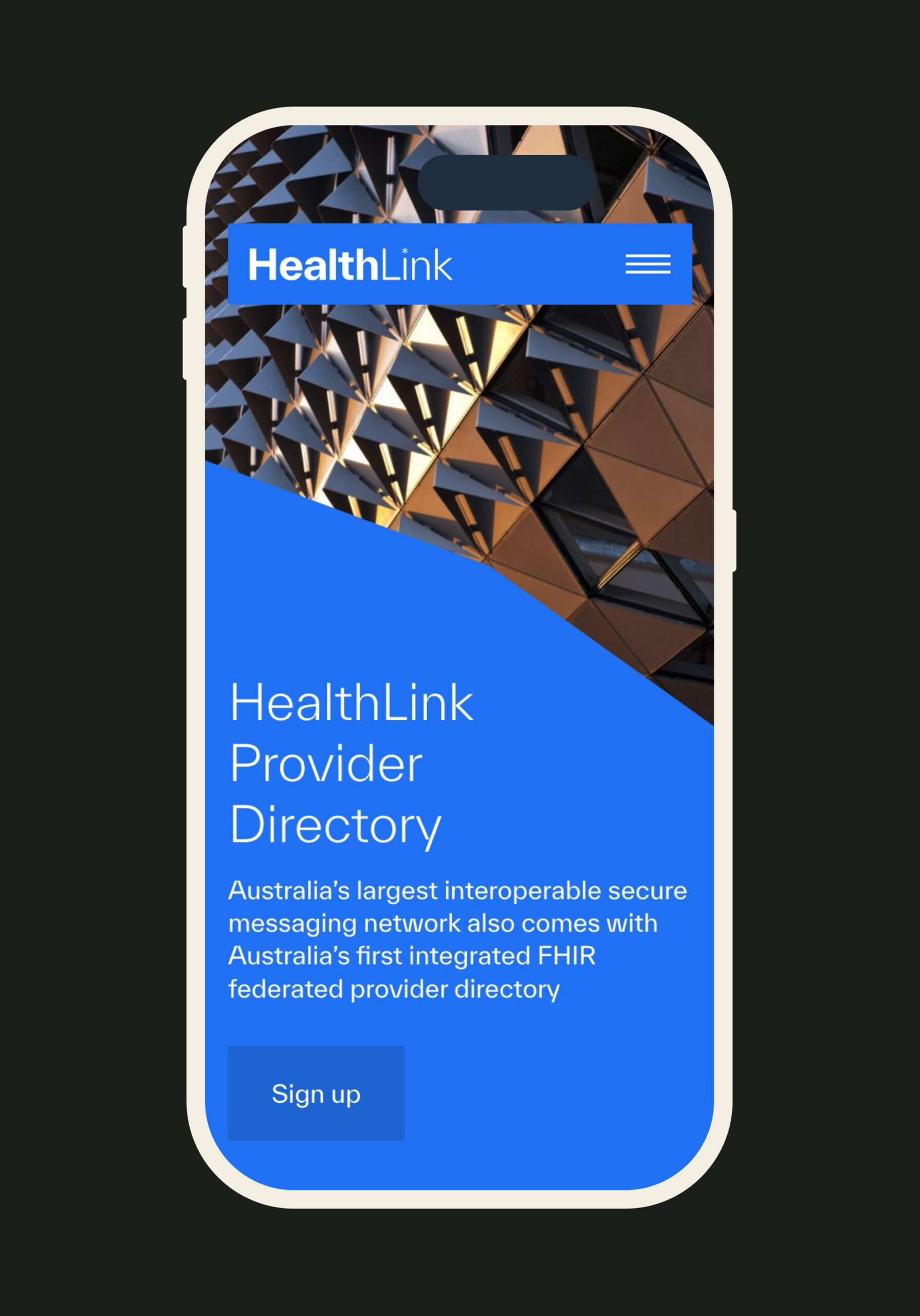
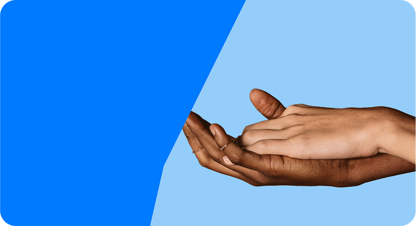
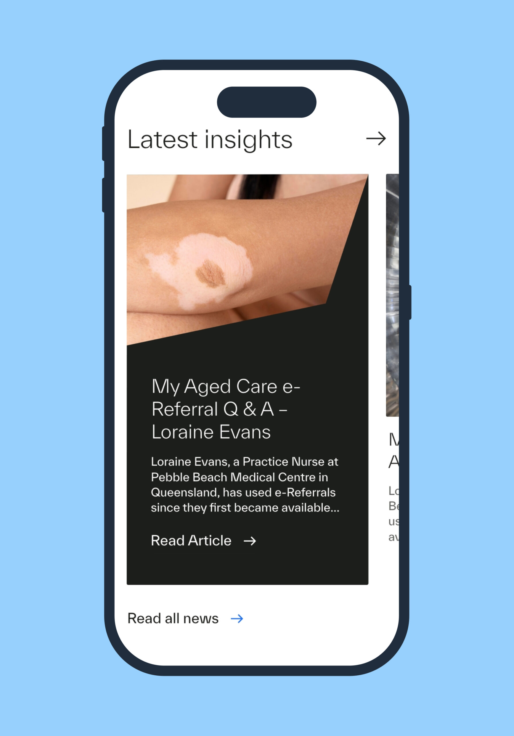
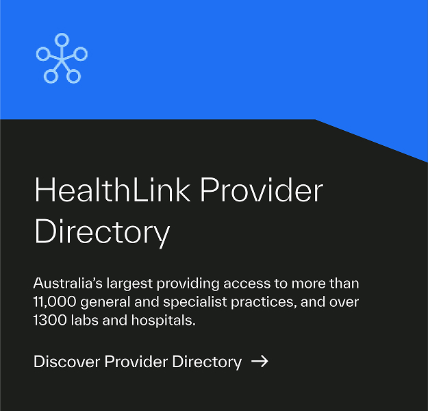
Imagery was also a crucial element. In the website design, we incorporated two distinct imagery styles: “Ever story,” featuring intimate close-ups of the human body, and a secondary style highlighting excellence in healthcare by blending technology, engineering, and quality. This comprehensive branding approach aimed to position Healthlink as a leader within the Australasia Healthcare network.
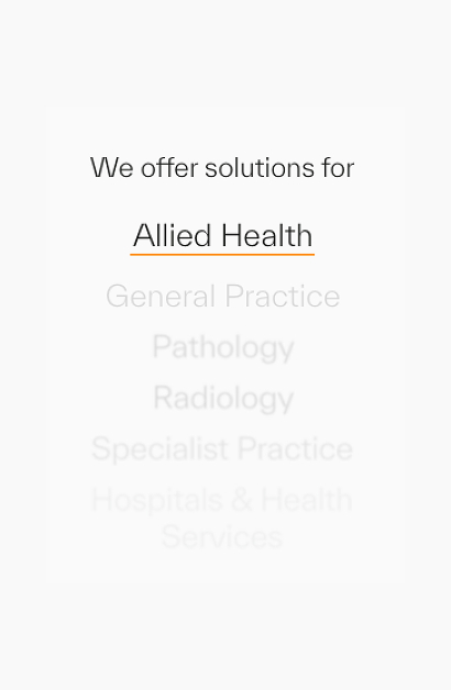
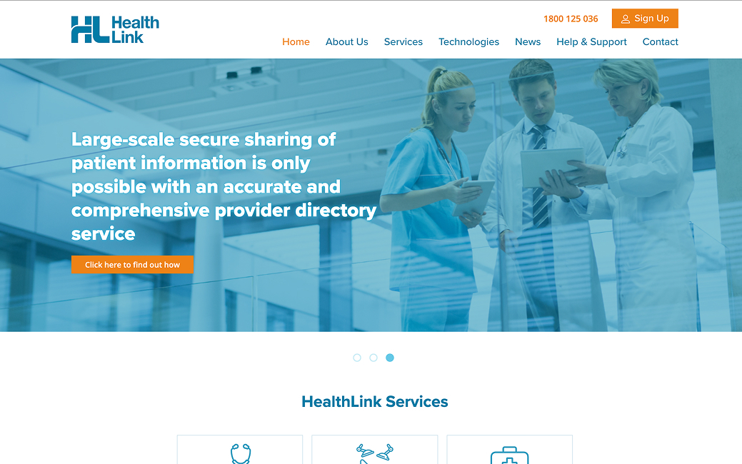
Clear user journeys and striking UI
The old Healthlink site had an outdated UI with no clear navigation markers. A combination of new brand assets and clear user flows meant the new site was able to guide the user through to the sign-up forms.
The visual exploration phase was really about how we can showcase the new Healthlink brand on their website.
We presented multiple, different moodboards and worked closely with the brand team to align on the direction of the UI.
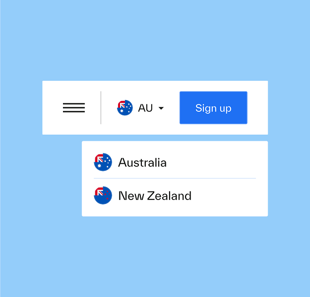
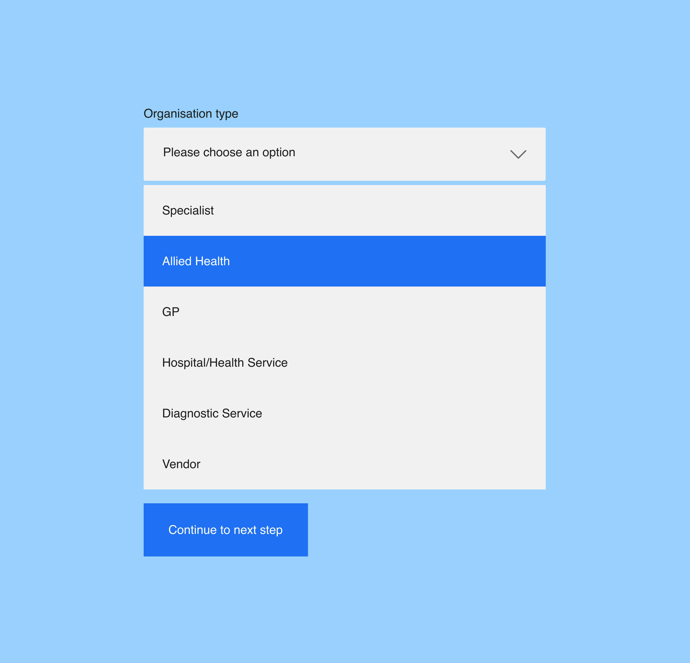
Once the moodboard and visual direction of the site was established we moved onto mapping out user journeys and conversion-focused flows.
The sign up flows and logic behind the different variations of these routes depending on which product the user wanted to sign up to meant that a substantial amount of time had to be spent during this phase.
We liaised with multiple Healthlink teams internally to ensure everyone was aligned on the direction.
The new Healthlink site is visually striking, leaning on the brand guidelines and built to reflect a diverse, inclusive society with imagery chosen to represent a range of ages, genders, and ethnicities.
The visual exploration phase was really about how we can showcase the new Healthlink brand on their website.
We presented multiple, different moodboards and worked closely with the brand team to align on the direction of the UI.
Once the moodboard and visual direction of the site was established we moved onto mapping out user journeys and conversion-focused flows.
The sign up flows and logic behind the different variations of these routes depending on which product the user wanted to sign up to meant that a substantial amount of time had to be spent during this phase.
We liaised with multiple Healthlink teams internally to ensure everyone was aligned on the direction.
The new Healthlink site is visually striking, leaning on the brand guidelines and built to reflect a diverse, inclusive society with imagery chosen to represent a range of ages, genders, and ethnicities.
Beyond the launch
We continue to work closely supporting the Healthilink team as their business goals evolve. Our work includes new website features, SEO consultancy and we also work with the client reactively to manage and support with any bugs.