We focus on creating intuitive, personalised experiences that align with users’ goals.
We’ve worked with a range of clients to design and build many different types of platforms. From SaaS platforms and booking engines, to Intranet, Interactive or Intelligence portals.
Every element, from navigation to interface components, is designed to support scalability, performance, and seamless customisation as your platform evolves.
A clearly defined process
Our platform design approach follows a waterfall methodology, ensuring each phase - from research and ideation, to development and deployment - is meticulously planned and executed.
Research & planning
Research & planning
Structure & flow definition
Structure & flow definition
User Experience (UX) design
User Experience (UX) design
User Interface (UI) design
User Interface (UI) design
Development preparation
Development preparation
Platform testing
Platform testing
Web design
Our Design team takes the time to understand your audience and create tailored journeys that convert.
User Experience design
UX design makes your website easy to use - encouraging repeat engagement, building loyalty and, ultimately, driving revenue. Get a competitive edge and ensure you never lose potential customers to competitors.What our clients say
 Karl Grundy
Managing Director
Karl Grundy
Managing Director
 Gabrielle Joseph
Managing Director, Head of Client Development
Gabrielle Joseph
Managing Director, Head of Client Development
 Elizabeth Woodman
Managing Director
Elizabeth Woodman
Managing Director
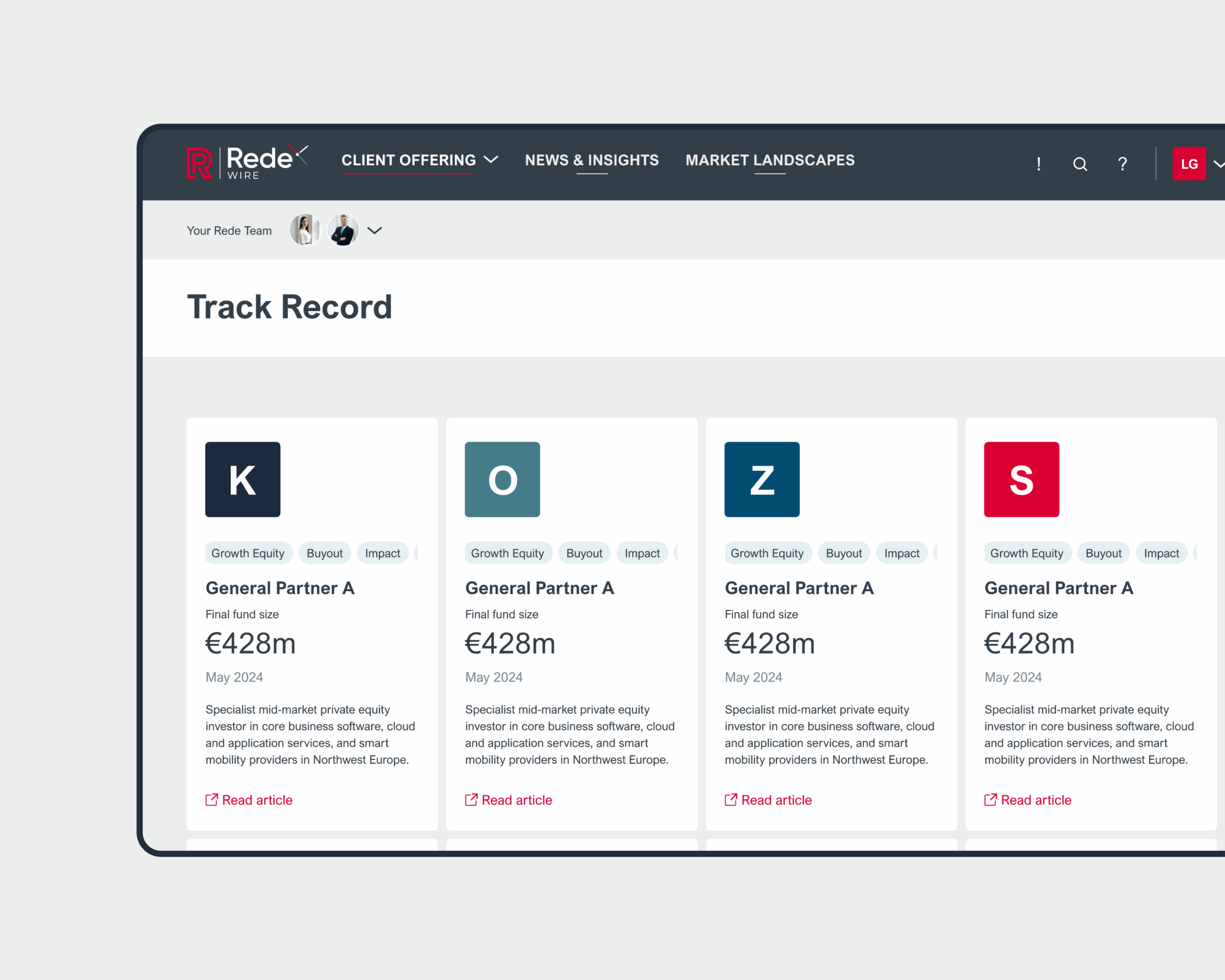
Some of the platforms we've designed
View all work‘Game-changing’ Digital platform for Rede Partners, allowing institutional investors to navigate upcoming fund.
Scaling WordPress for daily use in over 7,500 UK primary schools for Kapow Primary
Related news


FAQs about our platform design work
How do you use a design system when approaching large scale platforms?
For enterprise platforms, a design system is crucial because it scales easily, maintains brand consistency, and improves collaboration between design and development teams.
How do you ensure scalability in the platform design process?
We then design an architecture that can accommodate future expansion, focusing on modularity, and flexibility.
By anticipating future challenges, we create a platform that can scale efficiently over time.
Is your approach to platform design different from website design?
Yes, as generally platforms are more complex and scalable. Platforms involve:
- Multiple user roles with unique experiences
- Interactive features like dashboards and data analytics
- Scalable, secure data management
- Extensive third-party integrations (e.g., CRMs, payment gateways)
Websites are typically content-driven with simpler data and functionality needs.
What breakpoints will you design in?
We design all our designs for mobile, tablet and desktop. The breakpoints we design to are:
- 1920px – Most external monitors
- 1366px – Most laptop screensizes
- 992px – Most notebook / iPads devices
- 768px – Most other tablet devices
- 375px – Most mobile devices
How do you ensure website scalability for growing enterprises?
SoBold approach design using design systems that can easily be upgraded and extended without disrupting existing operations.