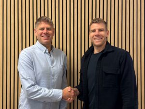
SoBold are delighted to announce that we have obtained a sponsor licence in order to sponsor international skilled workers to come and work at SoBold.
SoBold have always put heavy emphasis on hiring the best global talent for our needs, and we have strengthened our ability to do this by obtaining a Skilled Worker Sponsorship Licence.
With all sponsorship licences that the Home Offices grants they need to be reassured that the sponsors can live up to the “significant trust” that the department places in them. The Home Office further made checks that SoBold is a “honest, dependable and reliable” workplace, and capable of meeting the responsibilities that it expects from sponsors.
Since being granted our Skiller Worker Licence, we have been fortunate enough to put it to use to hire two new team members.
Anna de Moraes, joined SoBold, from Portuguese company, SpringParrot. Anna had been able to work remotely, and was living and working from the UK, when she got in touch with SoBold. Anna, who is natively from Brazil, said of the process:
“The steps were pretty clear and the whole process was quite simple. I’ve had friends waiting years for their visas to be approved while we were able to complete everything in a short period of time! I was already excited to start and, in a blink of an eye, I was finally part of the SoBold team!”
More recently, SoBold hired Santosh Gajera as a Back End WordPress Developer. Santosh has relocated from India in order to provide his services to SoBold. When asked about the process behind him getting his Skilled Worker VISA granted, Santosh said:
“To keep my IT career moving forward, I needed sponsorship from an organisation that sponsored my visa. SoBold has been an invaluable help in obtaining my Tier-2 (Skilled worker) visa. I am very thankful to their hard work and professionalism. My documents were handled very scrupulously by them, and they provided full support throughout the whole application process . I got my visa approved in two days, which is amazing, and they handled everything for me.”
SoBold worked with all-in-one digital platform, Nation Better in order to achieve our sponsorship licence and the process was streamlined, affordable and transparent.
SoBold already have a diverse talent pool, with staff from all over Europe, and with the help of Nation Better, we have been able to improve the way in which we hire international talent and open up opportunities further afield. We look forward to continue growing our team with exceptional overseas talent and have access to a wider talent pool.
SoBold Managing Director, Will Newland said:
We are absolutely delighted to welcome both Anna and Santosh to the SoBold team. Without our Sponsorship Licence we would be missing out on a large pool of talent that is the future of our business. We very much look forward to continuing to use our Sponsorship Licence to our advantage and giving skilled employees the opportunity to come and work here at SoBold.
For more information on what current vacancies we have, please visit our website careers page.
Would you like these insights straight to your mailbox?
- Innovation
- Creativity
- Clear strategic thinking
- Effectiveness
- Tangible results.
- Make a critical client engagement process increasingly efficient and effective
- Provide each user with a personalised experience that includes tailored investment information and updates
- Obtain more data about user engagement and leverage that to improve other services
- Accelerate and increase investment in client funds, driving significant commercial growth for the firm
- Use an industry-first digital tool to gain significant competitive advantages.
- Your target audience now has a shorter attention span, and less patience when browsing websites and services online.
- Your target audience also has more choice of options than ever before when choosing who to buy from.
- Boost SEO and brand awareness
- Improve audience engagement
- Reduce bounce rates
- Increase conversions
- Drive more sales through your website
- Accelerate business growth
- Improve customer retention and loyalty
- Gain competitive advantages.
- 1,920px – This covers most external computer monitor sizes
- 1,366px – This covers most laptop screen sizes
- 992px – This covers most Notebook and iPad devices
- 768px – This covers most other tablet devices
- 375px – This covers most smartphones.
- Keep your design simple and your content succinct
- Prioritise the preferences and best interests of your target audience
- Make your design elements as clear as possible
- Maintain consistency
- Ensure your brand, and your company’s identity, have been accurately represented through the design
- Use power of visual imagery to capture and retain your visitors’ attention
- Make your call-to-action as strong and compelling as possible
- Don’t create anything that interferes with the goals of your UX.
- Perceivable
- Operable
- Understandable
- Robust.
- Use contrast and blank space to make your content easy to perceive
- Use bold colours
- Use font sizes no smaller than 14px for desktop and 13px for mobile across the whole site (although, this does depend on the font you use)
- Use headings and structure correctly to organise content clearly on each page
- Make all your content easy to both see and hear
- Write all your copy in plain, simple language
- Avoid any flashing or blinking imagery or video content
- Write simple, clear, and helpful error messages.
Announcement
23 May, 2023
SoBold Selected as a Finalist for The Drum Awards for Marketing for Digital Transformation
We’re thrilled to announce that SoBold has been nominated as a finalist for an award at The Drum Awards for Marketing.
We’ve been nominated for our team’s outstanding work developing RedeWire, a unique, “game-changing” online portal for global financial services business Rede Partners LLP.
The Drum Awards for Marketing
The Drum Awards for Marketing are intended to highlight agencies and marketing teams that truly understand their clients. Focusing on outcomes, not outputs, these awards are designed to celebrate teams who have demonstrated the measurable value their work has delivered for their clients.
We’ve been nominated as a finalist in the transformation category. This category rewards creative and innovative thinking from agencies who have created a change in model or product to enhance experiences for their clients and their end-users.
The criteria on which the finalists were selected for this category included:
We’re incredibly proud to be named as a finalist for this award, especially since innovation, creativity, and strategic thinking are qualities that we actively strive to put into every project we work on for our clients.
“Game-Changing” Innovation – the RedeWire Platform
Global private equity (PE) fundraising advisory firm, Rede Partners, has a mission-critical process of keeping a large network of limited partner investors (LPs) updated with relevant, timely information about opportunities to invest in client funds.
The previous method of communicating this information to LPs was a large static PDF doc, produced once per quarter, shared with LPs via email. That approach is standard within the fundraising advisory industry, with many of Rede’s competitors using a similar approach.
But the Rede team recognised this needed to become more engaging for their clients, and our team here at SoBold provided an opportunity to innovate and transform this process.
We worked closely with Rede’s stakeholders to understand their challenges and define a clear set of strategic objectives. This allowed us to identify a way to remove this long-winded, one-way communication process with LPs and create a dynamic, interactive online portal.
RedeWire is the first of its kind, and has been identified as a “game-changer in the industry” by Rede’s LPs.
RedeWire successfully met Rede’s complex set of requirements, allowing them to:
The portal has already exceeded expectations for adoption, as it has made one of Rede’s critical points of communication with investors more efficient, effective, and engaging.
Check out our case study to learn more about the RedeWire platform here.
What they Had to Say
Gabrielle Joseph, Head of Due Diligence and Client Development at Rede Partners LLP, said:
“Originally conceived as a game-changer within our industry, we are thrilled with the outcome of RedeWire and have had several clients highlight how intuitive and easy to use the platform is.”
“Throughout the project, SoBold clearly understood our vision and provided thoughtful solutions to our needs. Choosing to partner with this team was one of the best decisions we’ve made, and we couldn’t be happier. We look forward to continuing to work with the team as the site evolves.”
One early adopter of the RedeWire platform also provided highly positive feedback, saying:
“This is a massive time-saver for everyone. I can’t believe how fluid and user-friendly it is. It will be a useful tool in 2023. We’re super impressed.”
Waiting for the Results
The results will be announced at the live awards show on June 15, 2023, in London. Congratulations must also go to our fellow finalists, Yodel Mobile, Braze, and Coterie Marketing.
Please keep your fingers crossed for us until then, and keep an eye out for the results this time next month!
In the mean-time, you can discover how financial services businesses should approach bespoke web development projects to successfully embrace digital transformation here.
Would you like these insights straight to your mailbox?
Development
10 July, 2023
Headless CMS Explained: Understanding Whether Headless is the Right Approach for Your Website
Making the best possible choice of content management system (CMS) is crucial for the success of your website. But, these days, not only do you have to navigate the many different options – from WordPress to Sitecore to Webflow – you also have the added challenge of deciding whether to go “headless” or not.
Whether to take the less conventional headless approach with your CMS is a decision that could cause some confusion. It could even cause some challenges with your website if you end up making the wrong choice.
In this article, we’ll help you understand exactly what a headless CMS is, when you may need to take that approach, and highlight some key considerations to make before finalising your choice.
What is a Headless CMS?
With a traditional CMS, the back-end and the front-end of the system are directly linked. This is how you use your CMS for both the content management (back-end) and to control how the content is presented to your website visitors (front-end).
In this context, the back-end of the CMS is sometimes referred to as the “body” and the “head” is the front-end. In a headless CMS, that front-end is decoupled from the back-end of the system, hence the term headless. With this approach, you use the back-end as normal for content management and the presentation of content in the front-end is handled completely separately.
This is valuable because it allows you to design your website front-end however you like, without any restrictions. However, it also requires more technical work from your development agency as a trade-off.
With a headless CMS, your content is presented to your audience on your live website by using APIs that take it from the back-end of the CMS. This use of APIs also allows you to publish the same content in a variety of different formats via different channels as well, but more on that later.
Scenarios in Which You Might Need a Headless CMS
It’s important to understand that you should only take a headless approach if it’s the most suitable way to meet a specific set of requirements or objectives.
Some scenarios in which you might need to take a closer look at adopting a headless CMS include:
If a large volume of content is a key component of your marketing strategy.
If you’re going to be producing and publishing a lot of content on your website, you may benefit from a headless CMS. Many people find it easier and more intuitive managing websites in the back-end of a headless CMS.
The decoupling of the front-end also means that your development agency will be the ones responsible for ensuring your audience is presented with dynamic, engaging content.
If you expect to have high volumes of traffic and need to maintain performance.
If the size of your website’s audience will put a heavy demand on your CMS’s performance, a headless system could be a worthwhile investment. Using APIs, and leveraging other intelligent techniques, the headless approach often delivers faster loading times, reduces the workload on your servers, and offers greater scalability.
If you have a multi-channel marketing strategy, or need to publish content across multiple digital touch-points.
The headless approach allows you to take one piece of content, upload it into the back-end, and seamlessly publish it across several channels, including website, mobile app, social media, email, and even internet-of-things (IoT) devices.
This can help you maximise consistency, while providing your users in each channel an experience optimised for their preferred context.
If you’re prioritising personalisation.
As personalisation is becoming much more important in modern marketing, headless CMSs are becoming more popular in enabling those tactics.
If you need to create personalised experiences for your website visitors based on their demographic data, past behaviour, preferences, and so on, a headless CMS may be the right option. This is a useful approach for delivering tailored content to individual visitors, improving your engagement and increasing conversions.
If you have a multi-lingual or multi-regional website.
Delivering the same content to visitors in different languages, across different locations, can also be made easier by using a headless CMS. Your localisation process can be streamlined by managing the content for all users just once in the back-end, then delivering it seamlessly in its different forms based on location or other conditions.
Key Considerations and Potential Pitfalls
While a headless CMS can be a great choice to deliver on the requirements discussed here, it’s still not a straightforward decision in these scenarios.
Firstly, it’s important to note that a traditional CMS like WordPress can still help you achieve all the things listed above, especially with the support of an experienced, talented agency. Secondly, there are some downsides to the headless approach that need to be considered while you’re evaluating your options.
Security
Security is an issue that needs careful consideration when looking into the headless approach. The headless architecture, and use of APIs, create more security vulnerabilities than you’d have with a traditional CMS.
It’s also common for a headless CMS to require more hands-on management in key areas such as hosting and compliance, as well as more thorough and frequent testing.
Development Complexity
When you ask your development agency to build, manage, and maintain your website using a headless CMS, you’re asking them for more complex work than they’d be facing with a traditional system. This complexity is something you need to be aware of, both in your selection of an agency capable of delivering your requirements, and in the additional workload you’re asking them to complete for you.
Time-to-Market
Following on from the previous point, more complex development work often results in a longer time-to-market for your website.
Developing a website using a headless CMS may require more time and resources from your agency to deliver the work for you. If you need to get your site up and running quickly, or if you may require future development work to be delivered quickly, a regular CMS may be a safer bet.
Technical Skills
Publishing content with a headless CMS may be easy, but if something goes wrong, or you need something changed, you’re unlikely to be able to do it yourself. A headless CMS requires more technical skills and development experience to maintain than a traditional CMS, even for small tasks. If you don’t have these skills in your team, you’ll be more reliant on your agency partner than you would be with a normal CMS.
Total Cost of Ownership
All the points listed here will add up to a higher total cost of ownership (TCO). When accounting for the higher volume and greater complexity of work you’ll require from your agency, you’re likely to spend a lot more of your budget on a headless CMS.
Unless you have specific complex requirements that demand the use of a headless CMS, it’s usually the more cost-efficient option to go with the more traditional approach.
Content Strategy
With all that said, it’s also important to consider whether a headless CMS is even necessary based on your content strategy.
Unless you have an intricate, wide-ranging content strategy that spans various channels and platforms, it might not be worth adopting a headless CMS at all.
Most of the requirements you have can likely be delivered by working with a reliable agency partner using a sophisticated, flexible CMS like WordPress.
It’s also important to note that WordPress can be used in a headless context as well. This offers you a balance between a familiar, easy-to-use system and a more dynamic UX for your visitors in the front-end.
The Benefits of a Headless CMS
If you do decide to take a headless approach, your CMS can deliver a wealth of benefits and strategic advantages. These include:
Scalability
The headless architecture will enable you to build out your digital presence rapidly, on a large scale, across multiple channels. This scalability will be crucial for your website as your business grows and your requirements evolve.
Customisation
Both the back-end of your headless CMS and the front-end presentation of your content are entirely customisable, tailored to your specific requirements.
Flexibility
Headless CMSs provide a great deal of flexibility in terms of your selection of technology, content creation, and implementation of a multi-channel market strategy.
Ease-of-Use
If you work with a skilled agency partner who can set up and manage your system for you, publishing and editing content with a headless CMS becomes quick, easy, and efficient.
User Experience
Delivering your content seamlessly – and consistently – across a wide range of channels and digital touch-points creates a far greater UX for your target audience.
Performance
The headless architecture removes the need to render pages on your server. This creates the faster loading times and improved performance discussed previously, which also contributes to a better experience for your visitors.
Competitive Differentiation
As mentioned earlier, the headless approach allows you to create a truly unique UX. In an increasingly crowded, noisy online landscape, this can help you differentiate your website and stand above your competitors.
Future-Proofing
A headless CMS allows you to easily change or upgrade the technology you use for your front-end without having any impact on your back-end. This will help you become more agile and adapt quickly as new technology trends emerge in future.
Making the Right Decision for Your Unique Requirements
Ultimately, you should base your decision here on the specific requirements you have for your website and the circumstances you find yourself in.
While a headless CMS does offer a range of innovative capabilities, the additional costs and resources you’ll need to invest may not be worthwhile. For example, the traditional use of WordPress can provide you with most of the benefits discussed earlier.
Carefully consider your objectives, your strategy, and the resources you have available. Use those to weigh up all the pros and cons listed in this article in relation to your own website project.
The key thing is to clearly understand exactly what you need from your CMS, and use that to select the option that aligns best with your requirements.
Would you like these insights straight to your mailbox?
UX Design
15 May, 2023
Demystifying User Experience (UX) Design
As technology continues to evolve and advance rapidly, more of our daily lives are taking place in a digital-first context. When marketing your products and services, this means:
Modern users demand the same speed and convenience they get from the industry-leading sites and apps they use every day. That means you only have a matter of seconds to make a positive, memorable connection with your visitors.
UX design, therefore, serves as a critical phase within the end-to-end process of web design. This is essentially the practice of creating a website that allows your visitors to complete a process, take an action, or fulfill their need in as few steps or clicks as possible.
Despite its ever-increasing importance, UX design is a process that many businesses, and even many agencies, still struggle to get right.
To ease this challenge, and help you ensure your own website’s UX is designed effectively, we’ve written this article to outline the process in detail. We’ll also provide advice and tips to help you ensure your website can provide your target audience with an experience that drives them towards your desired outcomes.
What is UX Design?
The aim of UX design is to make it quick, easy, and convenient for your visitors to complete a task or process, or follow a call-to-action. Your UX involves everything from functionality, navigation, accessibility, layout, structure, and even the site’s content itself.
Designing your website in a way that’s intuitive and easy-to-use will provide your visitors with a satisfying UX. It’s important to note here that UX design shouldn’t be confused or bundled up with user interface (UI) design. UI design is its own separate phase of the process that comes slightly later.
Understanding the Design Process as a Whole
Research and Planning
Earlier in the overall design process, before you approach the UX, you should’ve gone through a thorough research and planning phase with your design agency.
This is important in ensuring that every decision you make towards your UX and UI will produce a more effective website capable of meeting your business goals and your audience’s needs.
Working alongside your agency, you’ll use this research to define the full scope of your website and all its requirements. This will include the creation of user personas and user journeys. These will help you determine the most simple and efficient flow for your visitors to take through your website to each call-to-action, and this is how your UX is created.
This research will guide both your UX design and UI design processes.
Related reading: Understanding the Important Role of Research and Planning When Designing a New Website.
Visual Exploration
Your agency partner should then produce a set of mood boards that you’ll use to create the aesthetic style of your site in line with your brand. These mood boards help you visualise the way your website will look and feel when built.
This is a precursor to your UI design, and it’s done before the UX phase to ensure the overall style is correct before any more design work is completed.
This is another collaborative process, where your agency should advise you with their expertise and experience from delivering successful website projects in the past.
Related reading: What is Visual Exploration in the Process of Web Design?
The UX Process
Information Architecture
The information architecture of your website is devised by building a sitemap, which is a map of all the necessary pages across your entire website. You’ll likely have an existing one from your current site, but this will probably need updating based on all the new research and strategic planning you’ve done.
From the sitemap, you’ll have a list of all the pages and content required to populate your site. Your agency will then build out a content base framework, noting any content that you need support in developing.
The users’ navigation through the site needs to be tailored to the objectives you’ve set and the research findings from earlier. It also needs to be built in a way that allows for flexibility and scalability later, as your requirements evolve and your business grows.
High-Fidelity Wireframes
Wireframes are used to design the user experience of your website. This is essentially like creating a blueprint of your website’s pages prior to beginning the actual design work, detailing the site’s flow and the users’ journey through it.
These wireframes are used to determine how the user can reach their desired outcome, or reach your desired call-to-action, in as few clicks or steps as possible. Remember, the purpose of UX design is to optimise that journey.
Here at SoBold, we use high-fidelity wireframes that provide a clear, detailed representation of the users’ flow to all calls-to-action. This is directed and influenced by the things we learned in the research and planning phase.
These wireframes are typically built on a standard desktop size, but they can be done on a mobile device screen size if you want your site to be designed mobile-first.
Wireframes are used to create the UX so you don’t get distracted by the visual design when evaluating the user journeys. This allows you to focus completely on the flow and the experience the user will have when visiting your site, without worrying about the aesthetic elements. It proves to be a much more effective approach towards creating an experience that will satisfy your visitors and help you achieve your objectives.
Again, this will be a collaborative process in which you’ll work closely with your agency, providing feedback on the wireframes to ensure they align with your requirements.
Once the mood boards and the wireframes are approved, all that’s left to do is apply the design to the wireframes to bring your website’s design to life. This makes the UI design process very quick and easy from here.
A Quick Word on Accessibility
Accessibility is a crucial aspect of any user experience.
Accessibility refers to how easy and accessible technology is for all users, regardless of their physical ability, location, personal background, or any other factors. While accessibility is primarily a concern for the UI design team, it’s also important in optimising your UX as well. After all, a website that isn’t accessible simply cannot be considered to have a good UX.
If accessibility isn’t included as a core component of your web design process, you should raise this as a concern with your agency.
Here at SoBold, accessibility is a key part of all our design processes, as we believe that all technology must be fully inclusive and equally available to everyone.
Related reading: You can learn all about what it takes to deliver good usability through your website in our related article here.
Finding the Optimum Balance
As touched on earlier, your target audience will be visiting your site with a goal in mind, and the UX is what enables them to achieve that easily.
Of course, you also have business objectives to achieve through your website, which must also be supported by UX design. That creates the need for balance between a UX that serves your visitors and supports your business strategy simultaneously. Your design should also play the important role of directing visitors to the calls-to-action that you want them to engage with.
Finding this balance is a challenge, and one that could have a negative impact if you get it wrong. This is where the guidance and expertise of a specialist agency partner becomes so important. All design is collaborative and iterative, and UX design is all about compromising to find the right balance.
The Business Benefits of Great UX
Finding a design agency you can trust, and investing the time to work with them to craft a truly outstanding user experience, will prove well worth it in the long-run.
UX design is complex, but the right agency can guide you by demystifying the process and helping you make the right decisions at every step. Finding that aforementioned balance between your strategic objectives and your target audience’s best interests can have a transformational impact on the performance of your website.
Providing your visitors with a great UX can deliver a wealth of other benefits as well, not only to the performance of your website but to your wider business too. For instance, a study by
Some of these additional benefits include:
Your UX isn’t Complete Without User Interface Design
The key thing to remember is that good UX design is really just helping your website visitors travel from their entry point to wherever they need to get to as easily and efficiently as possible.
In the UX phase of your project, you need to consider who the user is, what they’re aiming to do, and then determine how to enable them to do that with an intuitive design.
Once your UX design begins to come together, and you’re satisfied with everything, the next step will be for your agency partner to begin to design your user interface.
While UX and UI are separate, they’re also intrinsically linked. They need to work together seamlessly and complement each other in order for your website to be successful.
If you’d like to take a step back and learn more about the overall process of web design, read our related article here.
Would you like these insights straight to your mailbox?
UI Design
15 May, 2023
What Does Successful User Interface (UI) Design Look like?
As part of our web design series, we recently explained the process we follow when designing the UX of a website. If you’ve not read that already, it will be useful to go and have a look first before reading this article.
A study by Forrester Research has found that a well-designed UI has the potential to increase your website’s conversion rates by up to a 200% while UX design could raise conversion rates by a staggering 400%.
Whether you’re working with a web design and development agency or an independent designer, this process is equally important. Nailing the UI design process is a crucial step towards producing a website that will maximise engagement with your target audience and help you achieve your business goals.
So, let’s take a detailed look at how to run a successful UI design process.
User Interface (UI) Design at a Glance
The UI design process is the creation of the visual design elements of your website. Think about UI as the way in which you convey your brand’s visual identity and bring your UX to life. The UI is there to facilitate the UX.
How Does the UI Design Process Work?
Earlier in the process, we recommend conducting a visual exploration exercise, using mood boards to gain a clear understanding of how your brand will be conveyed and how your website will look and feel.
That visual exploration phase of the project is a pre-cursor to your UI design, as it creates the visual identity of the website, including use of colour, font, blank space, buttons, and more. Some agencies do this as part of the UI phase, but here at SoBold we like to keep it as its own stand-alone phase. You can learn all about the visual exploration phase and how it works here.
After you’ve been through the UX design process, you’ll have approved a set of wireframes, which give you a blueprint of your website’s structure and flow before anything is built properly.
Once you’ve approved those wireframes, then the visual design created with the mood boards will be applied to bring them to life. This is essentially how you create your UI.
Your agency will typically begin with the design of your website’s homepage. Like each phase previously, you can expect this UI design process to be collaborative. Be prepared to have all the stakeholders available to provide feedback to your agency, and work with them to perfect the design when it’s combined with the wireframes.
Once the homepage is approved, your design will then be applied across all the pages of your site. Again, this is an iterative, collaborative process based on feedback and revisions.
Responsive Design Testing
On completion of the desktop designs, your agency partner will work on designing the site across multiple break-points. To ensure your site is responsive across all the most popular devices, the following break-points should be tested as a minimum:
You’ll then reach the exciting part, where your website is fully designed for you to view, test, and play around with. Once you’re happy with the design across the different break-points, your agency partner will be ready to prepare the design for a development handover.
What Does Effective UI Design Involve?
Good UI design is something that should feel seamless and almost invisible to your visitors when they land on your website. The aesthetics and visual style should be simple and engaging, while not distracting from the UX.
These days, you only have a matter of seconds to make a positive impression that can retain your visitors’ attention, so it’s crucial you don’t over-complicate things. But what differentiates good UI from bad UI in practical terms?
Like with UX design, there are some best practices you can follow to ensure your website has an effective, attractive UI.
Follow these guidelines to create a UI that delivers the desired experience for your visitors and supports your website’s strategic objectives:
Check out our related article for seven helpful tips to ensure your website is designed with great usability here for additional guidance.
The Importance of Accessibility
Accessibility is the practice of making technology as easy to use as possible, and fully accessible to everyone. While web accessibility is largely intended to help people with disabilities gain better usage of technology, it’s also much broader than that.
There are people who have difficulty using certain types of, or aspects of, technology who don’t have a disability. For instance, someone with deteriorating eyesight may find it difficult to read small text on a smartphone screen.
It’s also important to ensure your website is as easy to use as possible for the average person as well, because you should always strive to deliver the best possible UX for all your visitors. Accessibility is a key driver of this.
The Web Content Accessibility Guidelines (WCAG), which are used to define what constitutes good accessibility, lists four key principles of web accessibility that should be followed by all websites.
This means your website must be:
Web accessibility is an important topic, so we’ll talk more about that in a separate article. For now, it’s worth noting that any web design and development agency you work with should consider accessibility a top priority when designing the UI of your website. If they don’t, you should challenge them and ask why not.
Here at SoBold, this is built-in to all our design processes. We believe that all technology should be inclusive and equally available to everyone, regardless of their physical ability, location, personal background, or any other factors.
Some design best practices that we’d recommend you always follow to ensure your website is fully accessible, from a UI design perspective, include:
Preparing Your Website for Development
As you can see, UI design is mainly a case of applying the visual design that was created with the mood boards to your UX wireframes with the agreed flow. Good UI is no more than a clean, simple design that accurately represents your brand identity. While it sounds straightforward, it’s important to remember this is just one phase in the holistic, end-to-end process of web design.
To conclude the design process after the UI is complete, your agency will prepare your site’s designs for development. To learn how this process works, understand what to expect, and ensure your own web development process runs smoothly, read our next article in the series here.
Would you like these insights straight to your mailbox?
Industry News
21 June, 2022
Pixel Pioneers Bristol 2022
If you’ve never been to a conference of any type before, you possibly think you already know the important areas of your profession and can find out any developments from your colleagues or the internet. At least that’s what I thought prior to attending Pixel Pioneers 2022.
Which option sounds more appealing to you? Pick up extra skills on occasion, or go to a conference and absorb a mega-dose of industry knowledge, make connections and enjoy exploring fresh surroundings? Luckily at SoBold we have the opportunity to do both.
The conference covered both ends of the telescope – from broad topics such as energy consumption, to a fifty minute talk about the brief three milliseconds your screen goes blank in between webpage loads. How the visually impaired experience the internet, to technical developments in styling / fonts.
My personal hero was Chris How – his mantra of valuing your customer’s time and giving them small moments of delight strongly resonated with me. In accordance, I want to guide you through the content of the conference, with links to the core material that will best replicate what the SoBold team saw, whilst valuing your precious time.
GAVIN STRANGE : Less Thinkering, More Tinkering
A must watch to boost your levels of creativity. Gavin shares his personal and professional projects with Aardman Studios. Lots of useful insights into reaching the pinnacle of creativity. Highly engaging delivery, visuals and plenty of ‘further reading’ material. Definitely worth watching in entirety. Gavin Strange website – will give you a sense of his creative flair and influences. https://www.jam-factory.com/
“It’s better to beg for forgiveness, than ask for permission.”
Gavin Strange
BIANCA BERNING : Variable Fonts – WTF?
From a technical and design standpoint, learning about variable fonts is incredibly useful. Towards the end Bianca veers into the potential application of variable fonts – imagine a world where your computer mutates its content to fit the viewer’s specific needs. If you’re looking for new avenues for unique artistic features for your website – this talk is for you. Everyone should have a play with variable fonts – try it here https://v-fonts.com/
CHRIS HOW : You Got to Fight for the Right to Delight
Chris’s choice of examples and commentary is intentionally entertaining and eclectic. His approach to design changes your criteria for success and also would decisively influence your next project. Essential viewing. Whether you’re a seasoned designer or developer short of a design, this talk will give you a guiding direction. Information on the Kano product roadmap here. https://www.productplan.com/glossary/kano-model/
LÉONIE WATSON : Accessibility: The Land That Time to Interactive Forgot
Visually impaired people experience the internet through screen readers – the internet described in words. Léonie’s valuable insight will definitely re-balance your priorities and appreciation for how websites should function. Some of the technical history she overviews was a bit lost on the audience but the switch in mindset is valuable. Important to dip into, especially for gleaming a deeper understanding of how a web document is compiled and loaded. It might sound ‘techy’ but it’s like understanding how our lungs work – illuminating. If you haven’t viewed any of your own websites using a screen reader – you definitely should. For a great sense of how the net is best experienced for visually impaired users – just check out her website – tink.uk
LUKE MURPHY : Lightning Talk: Design Tokens – Searching for a Source of Truth
Design Tokens act as a very useful tool for blending the boundaries of where design and development meet, in fact, they act as a technical element that affect design and development in equal measures. If you have no idea what a design token is – this talk could unlock a tonne of structure for your product. Here’s an overview article on design tokens
HANNAH SMITH : How to Make Digital Services More Sustainable
Hannah Smith’s talk invited us to critique our energy consumption and make changes to our habits as both consumers and producers of digital content. She makes the case that space travel is a waste of resources, and that using less lays the path to fulfilment. See if her arguments resonate with you. Hannah’s book recommendation – Doughnut Economics by Kate Raworth
JHEY TOMPKINS : Supercharge Your Skills with Creative Coding
A mad professor of CSS and JavaScript – Jhey has a mixture of technical tricks and interesting libraries for speech recognition. Deadpan yet full of colourful examples, Jhey clumsily demonstrates his collection of magical creations and challenges you, the developer, to break out of your ‘siloed’ mentality for visual presentation. Check out his catalogue of wondrous CSS/JS creations here
STUART LANGRIDGE : You Really Don’t Need All That JavaScript, I Promise
Painting with the broad brushes down to the nat-hair infinitesimally small details, Stuart reminds us of the importance of returning to the basics in order to best utilise the web. Unfortunately some of the libraries he suggests do not have extensive compatibility and thus aren’t for mainstream production… yet. His insight does provide a deeper understanding of the mechanics of the tools we use, although the message is quite drawn out. Example of the shared transitions js library https://codepen.io/drenther/pen/NjzeOO
RACHEL ANDREW : What’s New in CSS?
Rachel Andrew – new css features either in or emerging from or newly arrived from CSS-land. Truly at the coalface of emerging CSS features. For a frontend developer it was akin to being shown new letters in the alphabet that were being proposed. A summary of similar information can be found here – https://www.smashingmagazine.com/2022/03/new-css-features-2022/
Bristol itself is well worth a visit – a centre for nightlife, hedonism and youthful idealism. Simply walking around the harbour area in the daytime will refresh your appreciation for one-of-a-kind shops and overflowing street art. Make sure you have plenty of free space in your phone for all the photos. The SoBold team had a very enriching experience and bonded even tighter as a team. I hope to see you at the next one!
Links to the conference videos will be available via the Pixel Pioneers website.