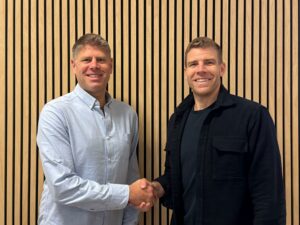
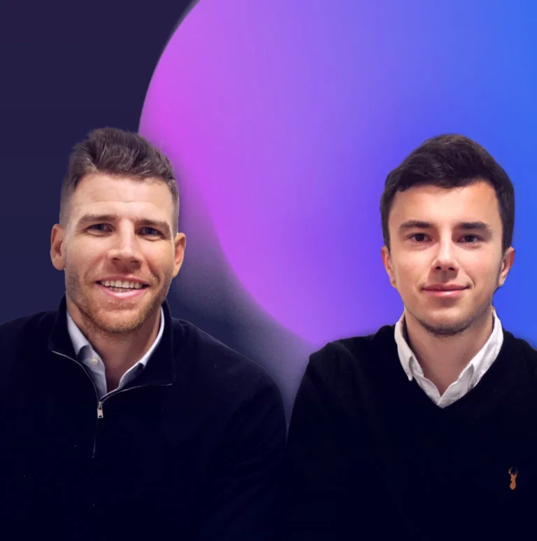
Technical Director, Sam Phillips and Managing Director, Will Newland were interviewed by Brent Weaver at Cloudways.
SoBold has been working with Cloudways since 2019 to help host development environments for all of their clients.
You can learn more about Cloudways, Managed Cloud Hosting services by visiting their website here.
See what they had to say in the video below.
Would you like these insights straight to your mailbox?
- 1,920px – This covers most external computer monitor sizes
- 1,366px – This covers most laptop screen sizes
- 992px – This covers most Notebook and iPad devices
- 768px – This covers most other tablet devices
- 375px – This covers most smartphones.
- Keep your design simple and your content succinct
- Prioritise the preferences and best interests of your target audience
- Make your design elements as clear as possible
- Maintain consistency
- Ensure your brand, and your company’s identity, have been accurately represented through the design
- Use power of visual imagery to capture and retain your visitors’ attention
- Make your call-to-action as strong and compelling as possible
- Don’t create anything that interferes with the goals of your UX.
- Perceivable
- Operable
- Understandable
- Robust.
- Use contrast and blank space to make your content easy to perceive
- Use bold colours
- Use font sizes no smaller than 14px for desktop and 13px for mobile across the whole site (although, this does depend on the font you use)
- Use headings and structure correctly to organise content clearly on each page
- Make all your content easy to both see and hear
- Write all your copy in plain, simple language
- Avoid any flashing or blinking imagery or video content
- Write simple, clear, and helpful error messages.
- Your brand
- Your company values
- Your colour scheme
- Your typography
- Imagery and other visual content
- Structuring of pages
- And other visual components that are used to tell your brand’s story across your website’s design.
Announcement
1 November, 2022
SoBold announce Cyber Essentials certification
SoBold announce their Cyber Essentials certification for the third consecutive year which demononstrates their commitment to delivering secure technical solutions to their new and existing clients.
Cyber Essentials is scheme which helps guard your organisation against a range of common cyber threats. SoBold’s resilience across a range of internet facing devices was tested and approved, ensuring there were not any major critical vulnerabilities discovered
SoBold Technical Director, Sam Phillips said:
With an ever growing cyber threat, Cyber Essentials certification is becoming more and more important to maintain. Protecting both our clients data and websites is of the upmost importance and successfully passing the more thorough Cyber Essentials guidelines new for 2022 shows our commitment to this.
Would you like these insights straight to your mailbox?
UI Design
15 May, 2023
What Does Successful User Interface (UI) Design Look like?
As part of our web design series, we recently explained the process we follow when designing the UX of a website. If you’ve not read that already, it will be useful to go and have a look first before reading this article.
A study by Forrester Research has found that a well-designed UI has the potential to increase your website’s conversion rates by up to a 200% while UX design could raise conversion rates by a staggering 400%.
Whether you’re working with a web design and development agency or an independent designer, this process is equally important. Nailing the UI design process is a crucial step towards producing a website that will maximise engagement with your target audience and help you achieve your business goals.
So, let’s take a detailed look at how to run a successful UI design process.
User Interface (UI) Design at a Glance
The UI design process is the creation of the visual design elements of your website. Think about UI as the way in which you convey your brand’s visual identity and bring your UX to life. The UI is there to facilitate the UX.
How Does the UI Design Process Work?
Earlier in the process, we recommend conducting a visual exploration exercise, using mood boards to gain a clear understanding of how your brand will be conveyed and how your website will look and feel.
That visual exploration phase of the project is a pre-cursor to your UI design, as it creates the visual identity of the website, including use of colour, font, blank space, buttons, and more. Some agencies do this as part of the UI phase, but here at SoBold we like to keep it as its own stand-alone phase. You can learn all about the visual exploration phase and how it works here.
After you’ve been through the UX design process, you’ll have approved a set of wireframes, which give you a blueprint of your website’s structure and flow before anything is built properly.
Once you’ve approved those wireframes, then the visual design created with the mood boards will be applied to bring them to life. This is essentially how you create your UI.
Your agency will typically begin with the design of your website’s homepage. Like each phase previously, you can expect this UI design process to be collaborative. Be prepared to have all the stakeholders available to provide feedback to your agency, and work with them to perfect the design when it’s combined with the wireframes.
Once the homepage is approved, your design will then be applied across all the pages of your site. Again, this is an iterative, collaborative process based on feedback and revisions.
Responsive Design Testing
On completion of the desktop designs, your agency partner will work on designing the site across multiple break-points. To ensure your site is responsive across all the most popular devices, the following break-points should be tested as a minimum:
You’ll then reach the exciting part, where your website is fully designed for you to view, test, and play around with. Once you’re happy with the design across the different break-points, your agency partner will be ready to prepare the design for a development handover.
What Does Effective UI Design Involve?
Good UI design is something that should feel seamless and almost invisible to your visitors when they land on your website. The aesthetics and visual style should be simple and engaging, while not distracting from the UX.
These days, you only have a matter of seconds to make a positive impression that can retain your visitors’ attention, so it’s crucial you don’t over-complicate things. But what differentiates good UI from bad UI in practical terms?
Like with UX design, there are some best practices you can follow to ensure your website has an effective, attractive UI.
Follow these guidelines to create a UI that delivers the desired experience for your visitors and supports your website’s strategic objectives:
Check out our related article for seven helpful tips to ensure your website is designed with great usability here for additional guidance.
The Importance of Accessibility
Accessibility is the practice of making technology as easy to use as possible, and fully accessible to everyone. While web accessibility is largely intended to help people with disabilities gain better usage of technology, it’s also much broader than that.
There are people who have difficulty using certain types of, or aspects of, technology who don’t have a disability. For instance, someone with deteriorating eyesight may find it difficult to read small text on a smartphone screen.
It’s also important to ensure your website is as easy to use as possible for the average person as well, because you should always strive to deliver the best possible UX for all your visitors. Accessibility is a key driver of this.
The Web Content Accessibility Guidelines (WCAG), which are used to define what constitutes good accessibility, lists four key principles of web accessibility that should be followed by all websites.
This means your website must be:
Web accessibility is an important topic, so we’ll talk more about that in a separate article. For now, it’s worth noting that any web design and development agency you work with should consider accessibility a top priority when designing the UI of your website. If they don’t, you should challenge them and ask why not.
Here at SoBold, this is built-in to all our design processes. We believe that all technology should be inclusive and equally available to everyone, regardless of their physical ability, location, personal background, or any other factors.
Some design best practices that we’d recommend you always follow to ensure your website is fully accessible, from a UI design perspective, include:
Preparing Your Website for Development
As you can see, UI design is mainly a case of applying the visual design that was created with the mood boards to your UX wireframes with the agreed flow. Good UI is no more than a clean, simple design that accurately represents your brand identity. While it sounds straightforward, it’s important to remember this is just one phase in the holistic, end-to-end process of web design.
To conclude the design process after the UI is complete, your agency will prepare your site’s designs for development. To learn how this process works, understand what to expect, and ensure your own web development process runs smoothly, read our next article in the series here.
Would you like these insights straight to your mailbox?
Digital Business
7 November, 2022
The Top Five Benefits of WordPress for Large Businesses
If you’re responsible for marketing, you’ll be well aware of the importance of a great content management system (CMS) for digital products like your website, mobile apps, staff portals, and so on. You may even need to create bespoke digital processes or systems unique to your business, such as internal training platforms or communications channels.
WordPress is the most popular CMS available today, powering almost 45% of the world’s websites. That popularity is on the rise, too, as more and more businesses realise the vast potential of the platform and the benefits it can deliver.
However, there’s still a misconception that WordPress isn’t suitable for large businesses. That’s no more than a myth, though. In fact, some of the biggest companies in the world use WordPress for their CMS.
But what are the specific reasons why that popularity has spread into the enterprise market over the past decade or so? To answer that question, let’s take a detailed look at the benefits and advantages WordPress offers large businesses:
1 – Scalability and Agility
WordPress is famous for its high level of scalability. However large your company, or the size and complexity of your site – as well as the amount of traffic passing through it – WordPress won’t have any problem managing that load.
Scalability is one of its most prominent advantages for large businesses, because it’s also agile enough to easily evolve and grow alongside your changing requirements.
The platform is more robust than most realise as well, with enterprise-grade performance and speed. This great performance also means user adoption and retention will always be high, helping you drive strong return on investment (ROI) on all the digital products you build.
2 – Flexibility and Customisation
WordPress is equally renowned for its flexibility and customisation, which are particularly useful for complex or bespoke development projects. You can use its flexibility to build bespoke features and functionality into your website or create an entirely unique system from scratch.
In large organisations where company-specific processes and workflows are common within your sites, this makes WordPress a highly beneficial option.
3 – Fast Time-to-Market
Thanks to its simplicity and intuitive usability, WordPress is a very efficient platform to build with. That gives you the advantage of delivering development projects with a very fast time-to-market. This is a significant benefit of any CMS, as it helps you save time, reduce costs, and provides more opportunity to test, iterate, and innovate.
4 – Integration
WordPress is very easy to integrate with other systems. Because most large enterprises have a lot of legacy technology to consider when implementing new systems, this is a huge benefit WordPress has over more cumbersome CMSs.
WordPress also integrates very well with back-end systems that are vital to your daily operations, such as HubSpot, Salesforce, PowerBi, and so on. This minimises disruption to your business while integrating WordPress into your existing tech stack.
5 – Low TCO and Strong ROI
WordPress comes with a very low total cost of ownership (TCO) when compared to other options. Unlike most CMSs, you won’t need to invest heavily in adding new features or capabilities, and you won’t need to worry about expensive extra work to manage upgrades or updates from the platform.
Because WordPress is so agile and rich with dynamic capabilities and features, it’s also proven to deliver strong ROI in both the short and long-term.
From a long-term value perspective, your initial projects won’t just stop at initial implementation, either. As your project or requirements evolve and your business grows, WordPress can seamlessly adapt and grow with you.
Other Points to Consider
It’s important to remember that every business, and every project, is different. While the benefits listed here do make WordPress an excellent CMS, you should still carefully evaluate how well it aligns with your specific objectives, requirements, budget, and other needs.
It’s also important to understand that most businesses will need the support of an agency with platform-specific skills and expertise to help you leverage a CMS to its full potential. As is the case with all platforms, it will be vastly easier to achieve your objectives and gain greater ROI, if you have the support of an experienced specialist partner to guide you.
If you’d like to learn more about WordPress, or need help deciding whether it’s a suitable option for your own requirements, we have a comprehensive guide to evaluating and selecting the enterprise options for a CMS here.
Would you like these insights straight to your mailbox?
Industry News
21 June, 2022
Pixel Pioneers Bristol 2022
If you’ve never been to a conference of any type before, you possibly think you already know the important areas of your profession and can find out any developments from your colleagues or the internet. At least that’s what I thought prior to attending Pixel Pioneers 2022.
Which option sounds more appealing to you? Pick up extra skills on occasion, or go to a conference and absorb a mega-dose of industry knowledge, make connections and enjoy exploring fresh surroundings? Luckily at SoBold we have the opportunity to do both.
The conference covered both ends of the telescope – from broad topics such as energy consumption, to a fifty minute talk about the brief three milliseconds your screen goes blank in between webpage loads. How the visually impaired experience the internet, to technical developments in styling / fonts.
My personal hero was Chris How – his mantra of valuing your customer’s time and giving them small moments of delight strongly resonated with me. In accordance, I want to guide you through the content of the conference, with links to the core material that will best replicate what the SoBold team saw, whilst valuing your precious time.
GAVIN STRANGE : Less Thinkering, More Tinkering
A must watch to boost your levels of creativity. Gavin shares his personal and professional projects with Aardman Studios. Lots of useful insights into reaching the pinnacle of creativity. Highly engaging delivery, visuals and plenty of ‘further reading’ material. Definitely worth watching in entirety. Gavin Strange website – will give you a sense of his creative flair and influences. https://www.jam-factory.com/
“It’s better to beg for forgiveness, than ask for permission.”
Gavin Strange
BIANCA BERNING : Variable Fonts – WTF?
From a technical and design standpoint, learning about variable fonts is incredibly useful. Towards the end Bianca veers into the potential application of variable fonts – imagine a world where your computer mutates its content to fit the viewer’s specific needs. If you’re looking for new avenues for unique artistic features for your website – this talk is for you. Everyone should have a play with variable fonts – try it here https://v-fonts.com/
CHRIS HOW : You Got to Fight for the Right to Delight
Chris’s choice of examples and commentary is intentionally entertaining and eclectic. His approach to design changes your criteria for success and also would decisively influence your next project. Essential viewing. Whether you’re a seasoned designer or developer short of a design, this talk will give you a guiding direction. Information on the Kano product roadmap here. https://www.productplan.com/glossary/kano-model/
LÉONIE WATSON : Accessibility: The Land That Time to Interactive Forgot
Visually impaired people experience the internet through screen readers – the internet described in words. Léonie’s valuable insight will definitely re-balance your priorities and appreciation for how websites should function. Some of the technical history she overviews was a bit lost on the audience but the switch in mindset is valuable. Important to dip into, especially for gleaming a deeper understanding of how a web document is compiled and loaded. It might sound ‘techy’ but it’s like understanding how our lungs work – illuminating. If you haven’t viewed any of your own websites using a screen reader – you definitely should. For a great sense of how the net is best experienced for visually impaired users – just check out her website – tink.uk
LUKE MURPHY : Lightning Talk: Design Tokens – Searching for a Source of Truth
Design Tokens act as a very useful tool for blending the boundaries of where design and development meet, in fact, they act as a technical element that affect design and development in equal measures. If you have no idea what a design token is – this talk could unlock a tonne of structure for your product. Here’s an overview article on design tokens
HANNAH SMITH : How to Make Digital Services More Sustainable
Hannah Smith’s talk invited us to critique our energy consumption and make changes to our habits as both consumers and producers of digital content. She makes the case that space travel is a waste of resources, and that using less lays the path to fulfilment. See if her arguments resonate with you. Hannah’s book recommendation – Doughnut Economics by Kate Raworth
JHEY TOMPKINS : Supercharge Your Skills with Creative Coding
A mad professor of CSS and JavaScript – Jhey has a mixture of technical tricks and interesting libraries for speech recognition. Deadpan yet full of colourful examples, Jhey clumsily demonstrates his collection of magical creations and challenges you, the developer, to break out of your ‘siloed’ mentality for visual presentation. Check out his catalogue of wondrous CSS/JS creations here
STUART LANGRIDGE : You Really Don’t Need All That JavaScript, I Promise
Painting with the broad brushes down to the nat-hair infinitesimally small details, Stuart reminds us of the importance of returning to the basics in order to best utilise the web. Unfortunately some of the libraries he suggests do not have extensive compatibility and thus aren’t for mainstream production… yet. His insight does provide a deeper understanding of the mechanics of the tools we use, although the message is quite drawn out. Example of the shared transitions js library https://codepen.io/drenther/pen/NjzeOO
RACHEL ANDREW : What’s New in CSS?
Rachel Andrew – new css features either in or emerging from or newly arrived from CSS-land. Truly at the coalface of emerging CSS features. For a frontend developer it was akin to being shown new letters in the alphabet that were being proposed. A summary of similar information can be found here – https://www.smashingmagazine.com/2022/03/new-css-features-2022/
Bristol itself is well worth a visit – a centre for nightlife, hedonism and youthful idealism. Simply walking around the harbour area in the daytime will refresh your appreciation for one-of-a-kind shops and overflowing street art. Make sure you have plenty of free space in your phone for all the photos. The SoBold team had a very enriching experience and bonded even tighter as a team. I hope to see you at the next one!
Links to the conference videos will be available via the Pixel Pioneers website.
Would you like these insights straight to your mailbox?
UI Design
18 April, 2023
What is Visual Exploration in the Process of Web Design?
When a visitor lands on your website, the visual design is likely to be the first thing they’ll notice. It’s also usually the thing they’ll remember most.
75% of consumers reportedly judge a business’s credibility based on its website design. This first impression can make or break a prospective client’s interest in working with you.
The ultimate goal of your website is to attract and retain as many prospects as possible, and then convert them into clients. But most websites are designed in a way that leaves those goals unfulfilled, failing to reach their full potential.
With that in mind, your visual identity should be treated as a top priority within the overall design of your website. Believe it or not, this can have a significant influence on the growth and success of your business.
When working on a web design project, you should always go through a careful visual exploration phase to find the right visual identity for your website.
Whether you’re going through a full company rebrand or just refreshing the style of your website, it’s important to ensure your design is tailored to your specific target audience. This is how you begin to drive business growth through your website.
Without a visual exploration process, your website may not convey your company’s brand identity and values as clearly as you’d like it to.
In this article, we’ll outline the steps taken so you’ll know what to expect when working on a website design project.
What Does the Process Involve?
The purpose of this process is to define the best visual direction to take with your site.
This is a crucial aspect of your overall design, with aesthetic elements being brought together to create a look and feel that engages your site’s visitors and retains their attention. To achieve that, your visual design needs to establish a connection between your audience and your brand immediately. It should also demonstrate why your visitors should work with you.
Exploring your visual identity will cover a wide range of elements, including:
What are Mood Boards and How Can You Use them?
The main tool used to help determine the right visual identity is a set of mood boards.
These are a visual compilation of all the various elements that make up your website’s visual design. Each mood board is essentially just a single-page collage of design styles based on previous discussions and the findings from the research and planning phase of the process.
The aim of these is to capture your brand’s visual style and tone. This will give the stakeholders, and your designers, a shared understanding of the design you’re working towards.
Mood-boarding helps you visualise the work on your website’s design before it begins and agree on a design aesthetic that accurately reflects your brand identity and values.
Think of this like a problem-solving exercise. Your design agency will take a research and data-driven approach to conveying your brand identity, while also catering to your target audience and accommodating the latest industry trends.
Collaboration and Iteration
Like most processes within web design and development, this visual exploration process should be collaborative and iterative.
You’ll typically be presented with a mood board and a set of ideas by your agency partner, then given the chance to provide feedback across several rounds of revisions.
Rounds and revisions are always important in any creative process. It’s usually necessary for your agency to develop and present a minimum of three mood boards before the optimum aesthetic is agreed upon. This is a crucial step towards the ultimate goal of creating a new website that accurately reflects your brand and has a positive impact on your target audience.
Connecting with Your Clients Through Design
Your website’s visual identity is what makes your brand resonate with your target audience. Your design needs to clearly convey the values of your business, the quality of your products and services, and the reason why your visitors would benefit from working with you.
Working through this visual exploration phase is an important step towards designing a website that will attract more visitors and increase your conversions.
Once this visual exploration is complete, the next phase of your web design process will be to craft your website’s user experience (UX).